Fonts
Use These Easy Guidelines to Significantly Improve Your Website Design
Having a personal website can be incredibly useful for your career. It is a central place under your control where you can send potential employers and clients to see your work. It is free from the noise and clutter of social media, and hyper-focused on your goals. However, it can be easy for a website…
Read MoreHow to be more creative – always keep your eyes open
I was reading a book to my child when the title struck me. Specifically, the nice font, the three words stacked on top of one another, the beautiful colors used. Immediately I began to think how perhaps this could be used as a title page for something else, or perhaps an ad. So using a…
Read MoreBetter Looking Text with a Dirty Little Trick
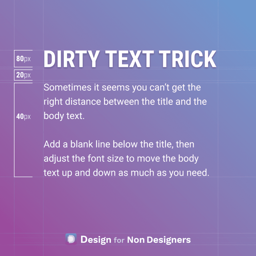
This one is a bit dirty…but sometimes you gotta do what you gotta do. Dirty in the sense that it would be better to set up the proper spacing, or better to work with the line heights, etc. But, sometimes you just have to finish that Pitch Deck, that Word Document, or that Website, and…
Read MoreHow To Find Great Font Combinations To Make Your Work Beautiful
Are you intimidated by fonts and don’t know where to start? Do you just use the default fonts in your presentations and documents but wish you could make things more beautiful? You’re not alone, and thankfully with some great free tools and resources it can be easy to make your documents more professional and enticing.…
Read More


