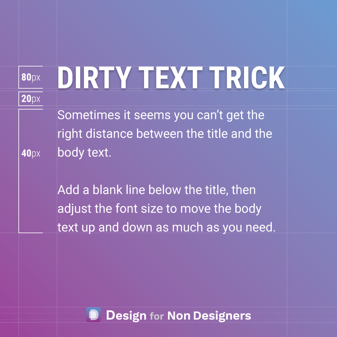
Better Looking Text with a Dirty Little Trick


This one is a bit dirty...but sometimes you gotta do what you gotta do.
Dirty in the sense that it would be better to set up the proper spacing, or better to work with the line heights, etc.
But, sometimes you just have to finish that Pitch Deck, that Word Document, or that Website, and the spacing just doesn't look right.
So, a simple little trick is to add a blank line below where you need spacing, and then adjust the height of the font on that line.
This way, you can completely control how much the content below moves up or down and get it looking just right.
A few little tricks for some quick, great looking results 😉
Want more tips like this?
Get them, resources, and more delivered to your inbox: