Document Design
Create a Better Slideshow Deck: Use Visual Waypoints
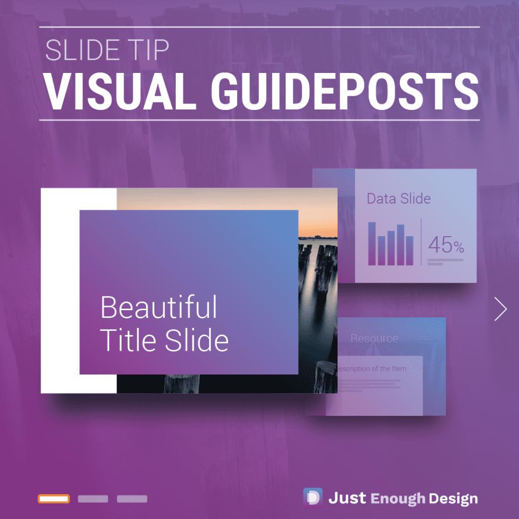
Reusing layouts or styles through a slideshow deck can have many great benefits. Like putting up informative guideposts as you walk your viewers through your presentation. A Familiar but Powerful Concept for Presentations You won’t be completely unfamiliar with this concept. A popular use of it in slide decks is the title slide. Often different…
Read MoreDesign Trick: How to Create a Better Presentation by Reusing Design Elements
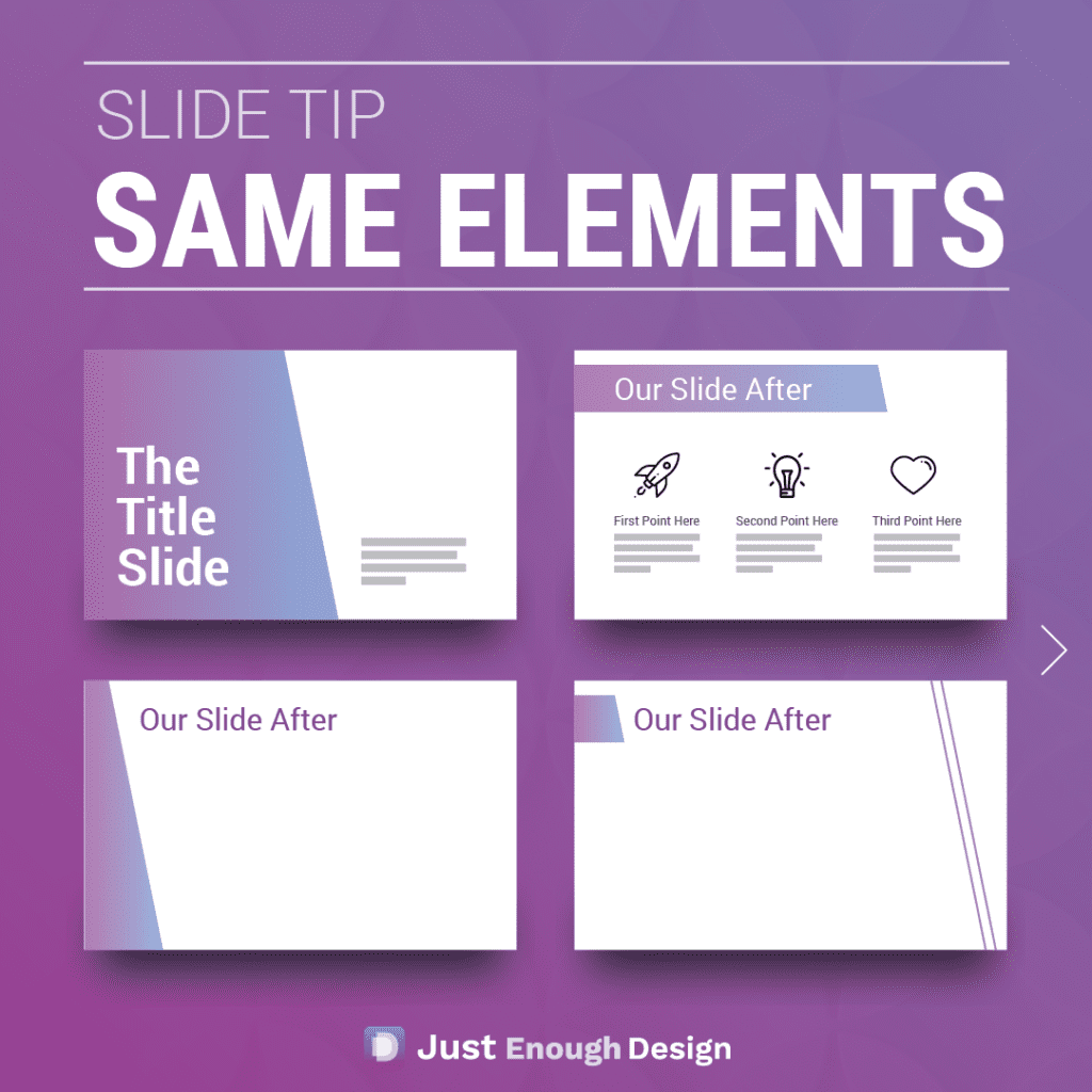
A simple way to make better designed and more professional slides? Reuse the same design elements throughout! Sometimes called a motif, once you’ve found a style you like keep applying it. In the example shown here, it’s a colored shape with an angled side. You can see how by using that same shape and color…
Read MoreHow to create a logo: What to ask for from a Designer
Logo design can be a true art form. The simplification of a company’s mission into a beautiful and recognizable mark. No small feat! Beginning the project can be exciting, but it’s important to know what to ask for as a deliverable. (Be sure to find plenty of inspiration at you begin!). You want to…
Read MoreDesign Answer: Should resumes, unrelated to design, ever be formatted creatively and graphic design heavy instead of plain and professional?
I would argue that no, a resume should never be graphic design heavy. To use design thinking itself to bolster the argument, what is the purpose of the resume? To relay pertinent information to the recruiter and show your competency. To introduce yourself and your skill set to the reader and land an in person…
Read MoreSimple Design Hack – How to give your layout nice spacing
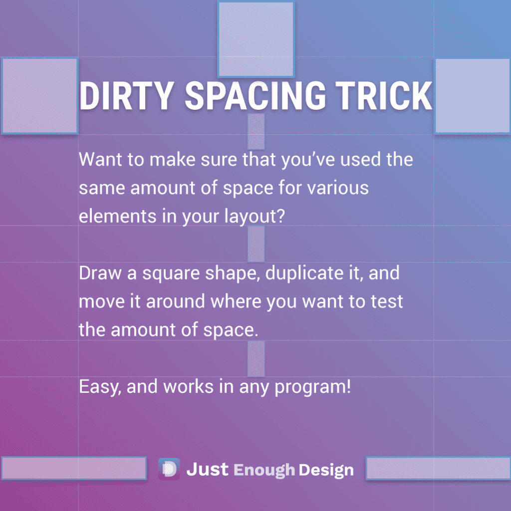
A simple but critical element to ensuring the layout of your work looks great is spacing. One element of spacing that’s easy to measure and has a large impact is the consistency of spacing. Do you have the same amount of space: Around all elements? Between elements? Within elements? It may feel…
Read MoreCreate better looking work: Proximity
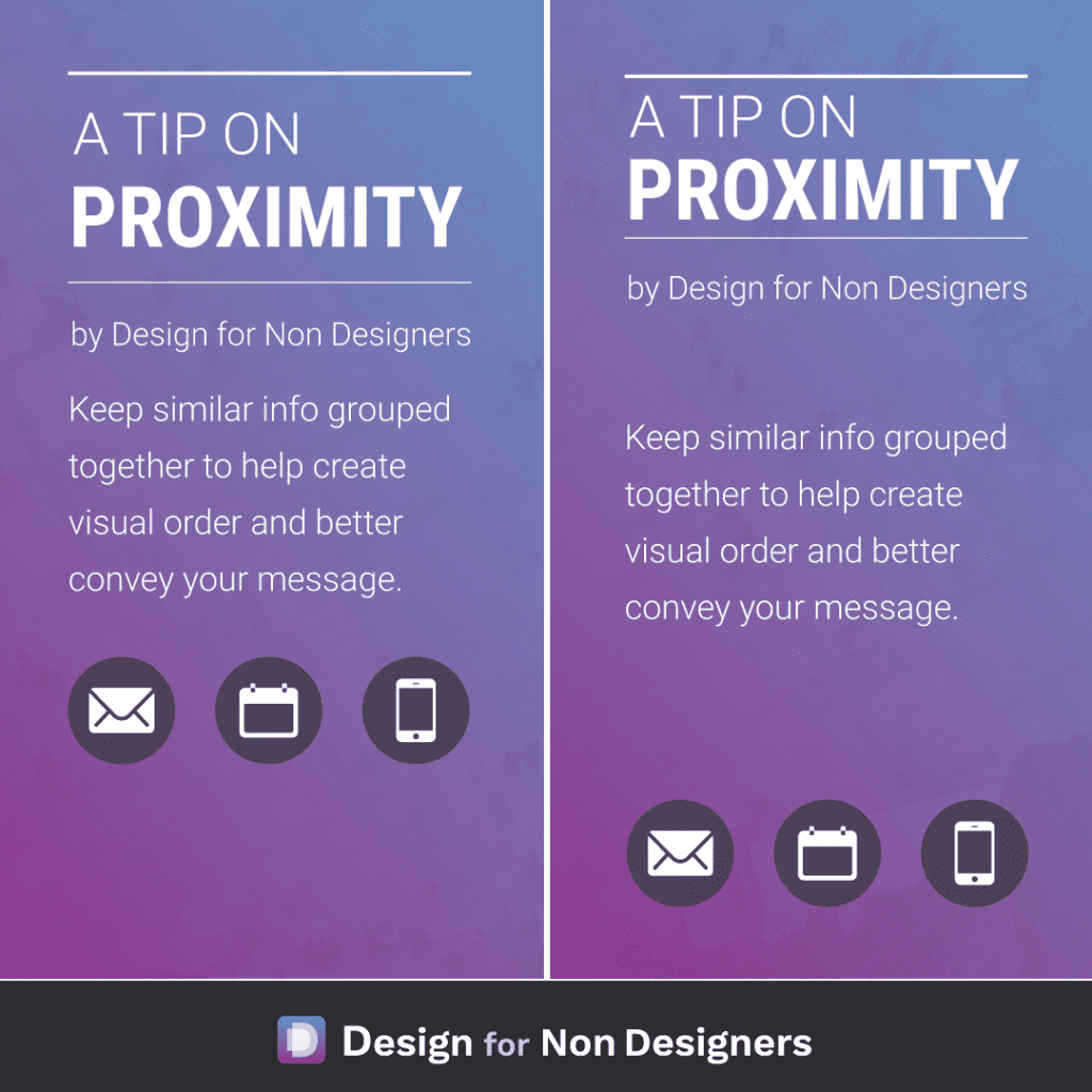
The human eye LOVES order, and you can use this in your work to make your message easier to digest and understand. By keeping pieces of information that are similar, like titles and authors (or subtitles), body copy, contact information etc. together, you lay out a flow and order for your viewer. You’re saying “here…
Read MoreHow to be more creative – always keep your eyes open
I was reading a book to my child when the title struck me. Specifically, the nice font, the three words stacked on top of one another, the beautiful colors used. Immediately I began to think how perhaps this could be used as a title page for something else, or perhaps an ad. So using a…
Read MoreDesign Trick for Better Layouts: Squint
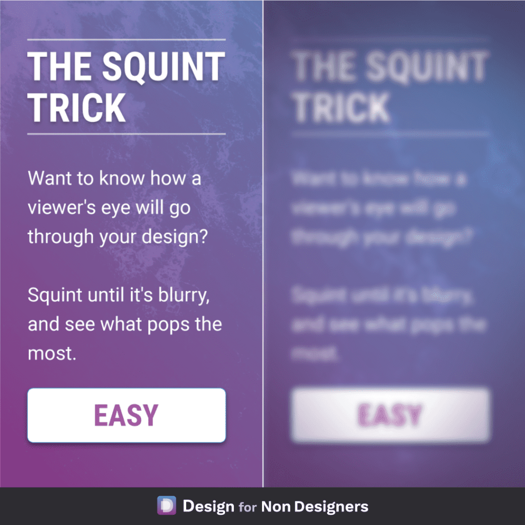
A useful little physical trick to help your digital work! If you want to know what element in your layout has the most prominence: look at it while squinting your eyes. This will blur the elements and remove some degree of distraction, and allow you to see what stands out the most. Followed…
Read MoreMake any work look better – Add White Space
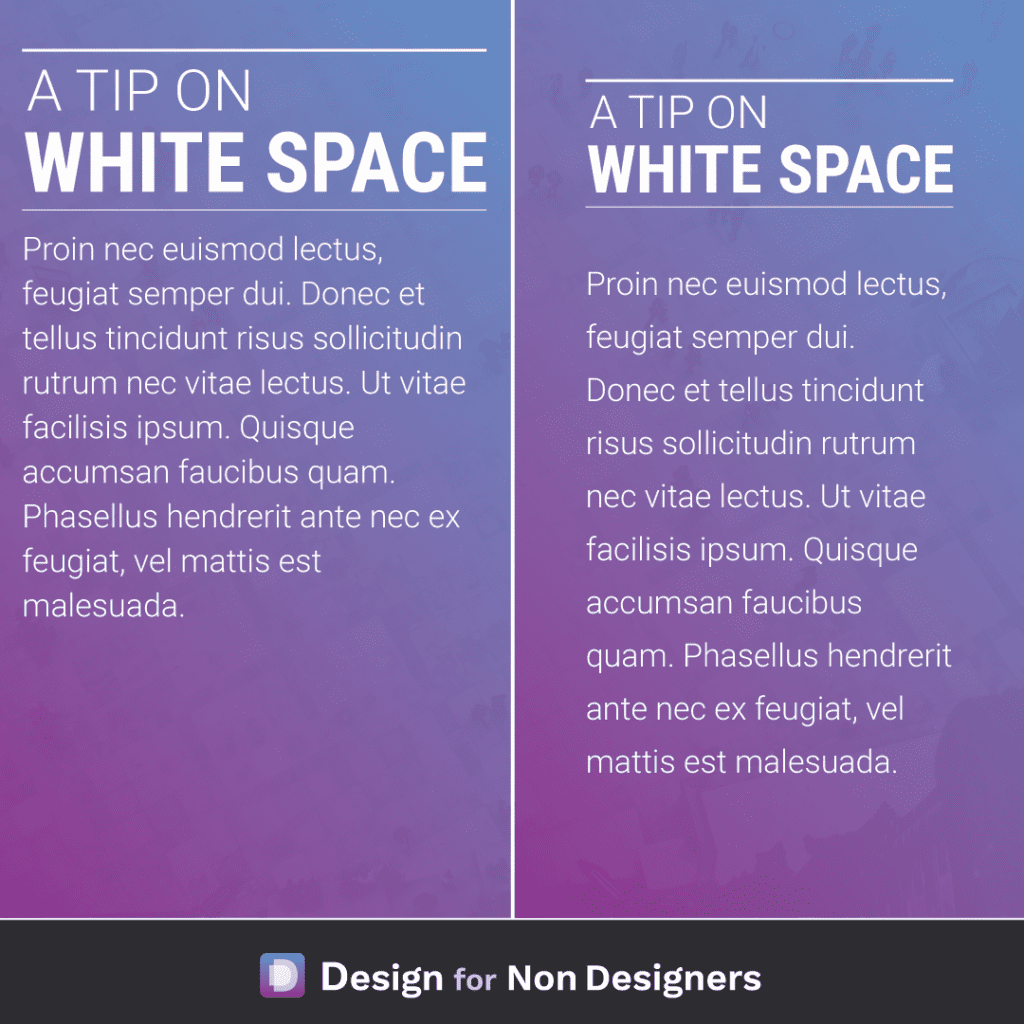
Making sure that content can breath is one of the most impactful ways we can improve our work. It helps focus attention on the various pieces, it allows for much easier reading, and produces work that feels more balanced and pleasant. Some quick ideas to apply include: adding more space to the left and right…
Read MoreHow to make great layouts – Rule of Thirds
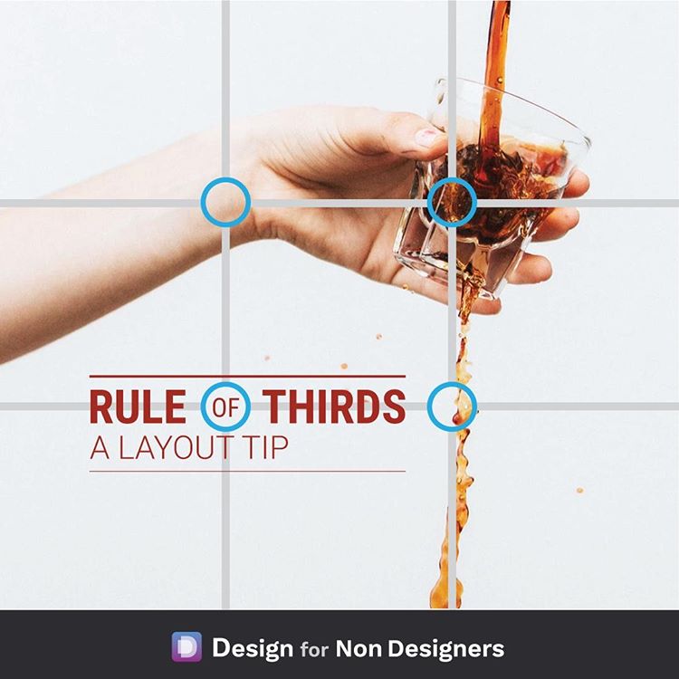
A simple layout guide to try if you’ve ever wondered where to place elements in your presentation / document / image. The rule of thirds, which works with both photography and graphics, takes 9 boxes of equal sizes to divide a space into thirds and give you points where the boxes intersect. These boxes give…
Read More