Design Tips
How to be more creative – always keep your eyes open
I was reading a book to my child when the title struck me. Specifically, the nice font, the three words stacked on top of one another, the beautiful colors used. Immediately I began to think how perhaps this could be used as a title page for something else, or perhaps an ad. So using a…
Read MoreAnswer: What are the best apps to learn graphic design in our smartphone?
See the Answer on Quora Since you’re limited in what you can do on a phone, it seems best to use the format to learn from other designers. Loading yourself up with ideas and methods to put into use for future. I’ll suggest four apps you can use to find inspiration and learn from for…
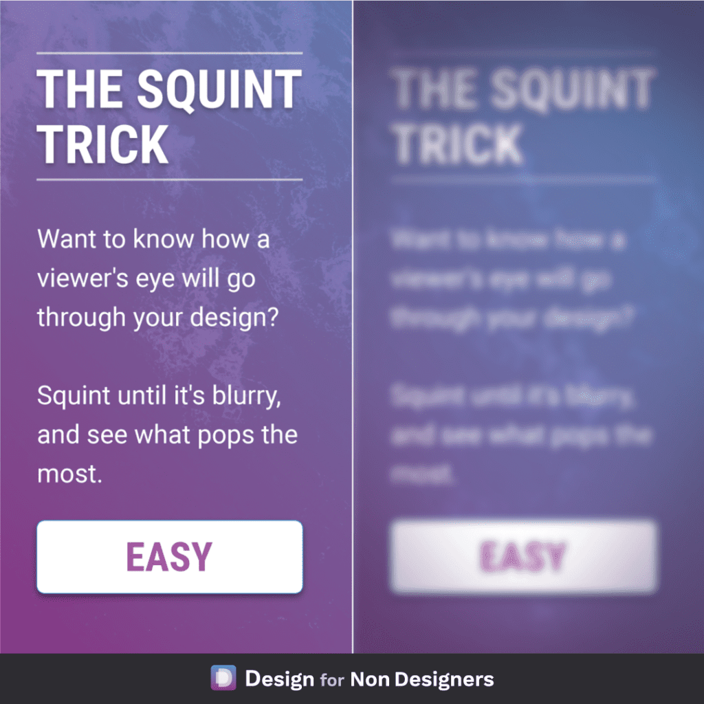
Read MoreDesign Trick for Better Layouts: Squint
A useful little physical trick to help your digital work! If you want to know what element in your layout has the most prominence: look at it while squinting your eyes. This will blur the elements and remove some degree of distraction, and allow you to see what stands out the most. Followed…
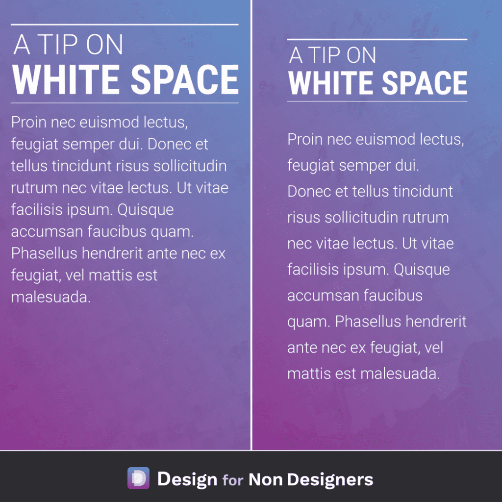
Read MoreMake any work look better – Add White Space
Making sure that content can breath is one of the most impactful ways we can improve our work. It helps focus attention on the various pieces, it allows for much easier reading, and produces work that feels more balanced and pleasant. Some quick ideas to apply include: adding more space to the left and right…
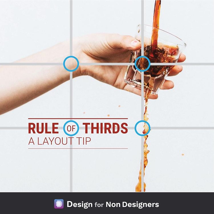
Read MoreHow to make great layouts – Rule of Thirds
A simple layout guide to try if you’ve ever wondered where to place elements in your presentation / document / image. The rule of thirds, which works with both photography and graphics, takes 9 boxes of equal sizes to divide a space into thirds and give you points where the boxes intersect. These boxes give…
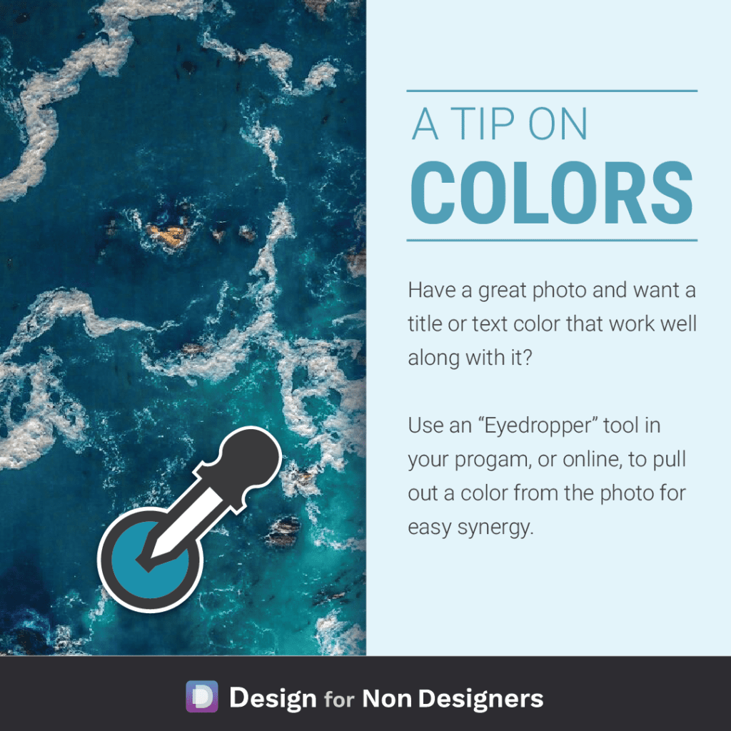
Read MoreHow to find colors for your work or documents
An simple way to find a color that will work with your great photo is to use a color from that same great photo! Either in the program you’re using (like Powerpoint), or with an online tool, simply click around the image until you find a color that that sits well with the image. If…
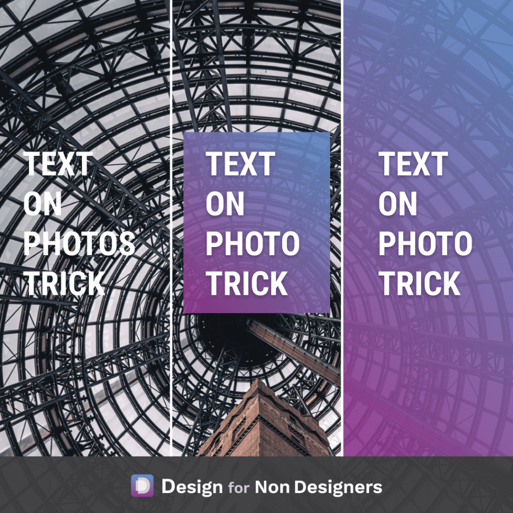
Read MoreHow to Place Text on an Image
Quick tip to ensure your text is legible if being placed on top of a great photo. If the text doesn’t stand out enough on it’s own against the photo, consider adding a slightly transparent colored square behind it! You can either place a square just around the text (though be sure to add a…
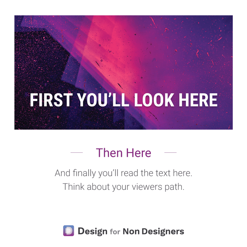
Read MoreTip for Better Design – Control the Viewer’s Path
We’ll often hear of the need to tell a story when we’re trying to present something or sell something. But often that only goes as far as the words. With visuals, the flow and reveal can be just as important. When you look at your pitch deck, your document, your ad: what do you want…
Read MoreHow to be More Creative: The 3 Use Trick
Hold my coffee…or…grow a plant, bake a cake, make sand castles! This is a simple but powerful way to train your mind and become more creative. Through the day, whenever you see an object, think of 3 additional ways you could use it. It can be done casually as you’re going through you usual routine,…
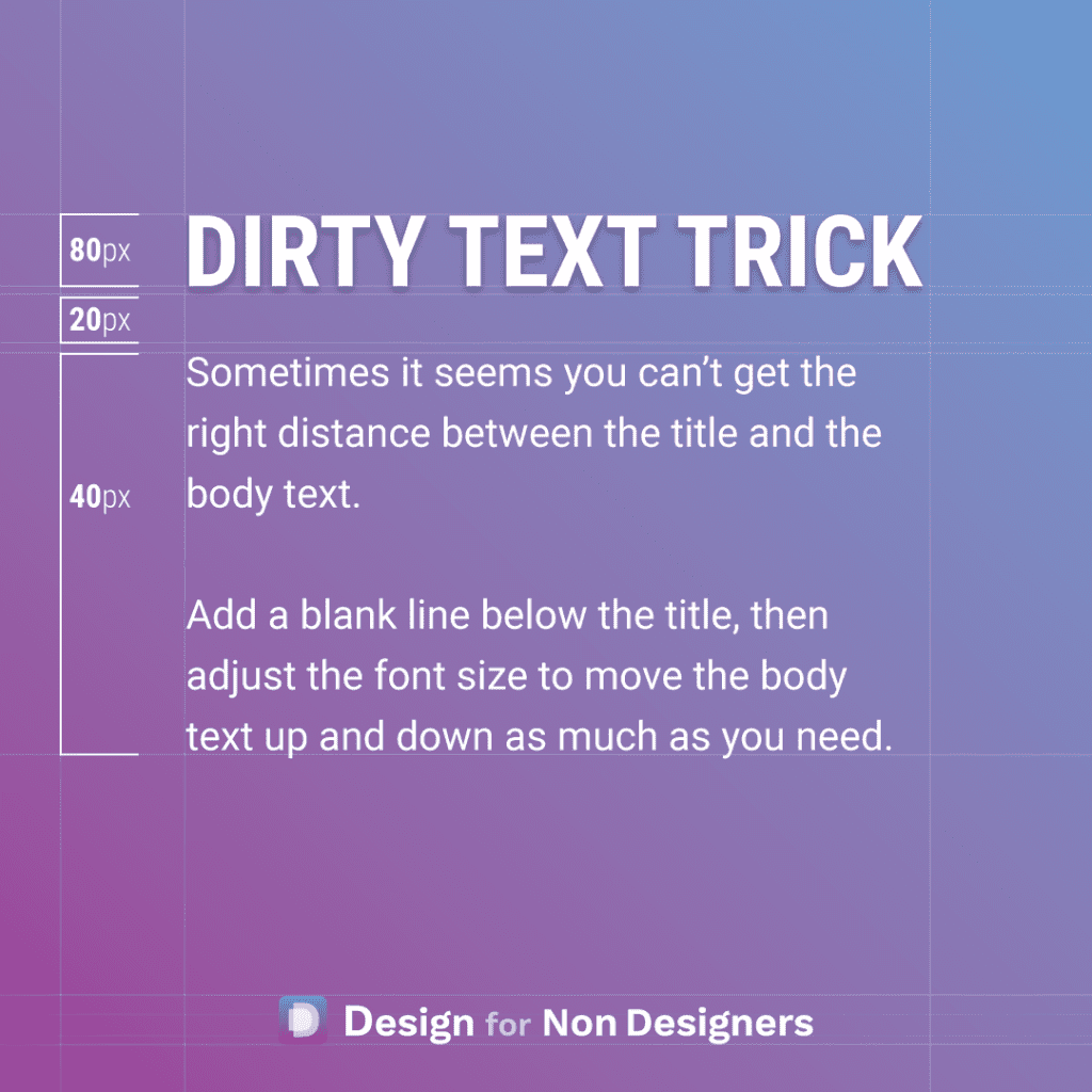
Read MoreBetter Looking Text with a Dirty Little Trick
This one is a bit dirty…but sometimes you gotta do what you gotta do. Dirty in the sense that it would be better to set up the proper spacing, or better to work with the line heights, etc. But, sometimes you just have to finish that Pitch Deck, that Word Document, or that Website, and…
Read More
