Recent Articles and Tricks
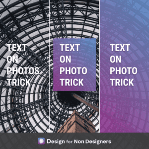
How to Place Text on an Image
Quick tip to ensure your text is legible if being placed on top of a great photo. If the text doesn’t stand out enough on it’s own against the photo, consider adding a slightly transparent colored square behind it! You can either place a square just around the text (though be sure to add a…
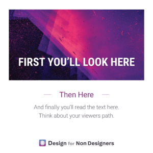
Tip for Better Design – Control the Viewer’s Path
We’ll often hear of the need to tell a story when we’re trying to present something or sell something. But often that only goes as far as the words. With visuals, the flow and reveal can be just as important. When you look at your pitch deck, your document, your ad: what do you want…
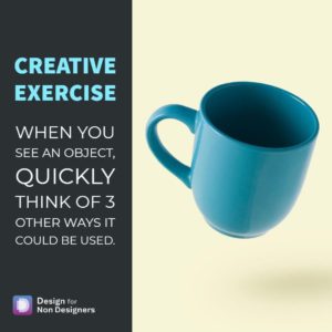
How to be More Creative: The 3 Use Trick
Hold my coffee…or…grow a plant, bake a cake, make sand castles! This is a simple but powerful way to train your mind and become more creative. Through the day, whenever you see an object, think of 3 additional ways you could use it. It can be done casually as you’re going through you usual routine,…
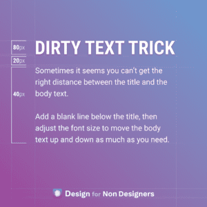
Better Looking Text with a Dirty Little Trick
This one is a bit dirty…but sometimes you gotta do what you gotta do. Dirty in the sense that it would be better to set up the proper spacing, or better to work with the line heights, etc. But, sometimes you just have to finish that Pitch Deck, that Word Document, or that Website, and…
Layout Options for Your Next Presentation / Document / Post
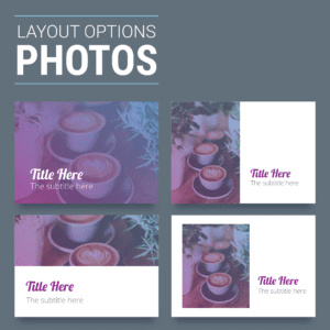
Do you draw a blank when looking at a blank screen for a post, a presentation, or a document? When it comes time to lay out your content, is it hard to know what to do? True story, most designers often get this sense of dread as well! But, they have 2 tricks at their…
Design Layout – A Tip On Focus
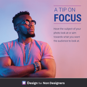
Have you ever caught yourself stopping to stare at what everyone else is looking at? It’s a natural human reaction, and one that we can use in our work to help direct our audience where we want them. Specifically, when we’re choosing photos that have a person, we can ensure they are looking towards where…
Workshop: Creating a LinkedIn Banner that represents your professional brand
It takes only seconds for someone to judge a LinkedIn profile, don’t you want to give the right impression? LinkedIn Banners are an underutilized asset of your profile, quickly conveying your message and competency to your target…if you’ve used it right. That’s what this workshop is about. We’ll walk through best practices for adding a…
Inspiration for Design: How to design better work
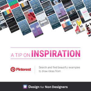
A truth of design is that so much of it is the act of inspiration. The act of finding interesting or cool ideas from other designers and mixing that for your own work. Creative ideas so rarely pop into a designers head. Rather they’re inspired from what others are doing and connecting the dots. What’s…
How To Find Great Font Combinations To Make Your Work Beautiful
Are you intimidated by fonts and don’t know where to start? Do you just use the default fonts in your presentations and documents but wish you could make things more beautiful? You’re not alone, and thankfully with some great free tools and resources it can be easy to make your documents more professional and enticing.…
Answer: What are the best videos online or offline to learn more about interaction/product design for the web?
Human Factors International offers a great series of videos on YouTube around User Centered Design and Usability. You can find their videos here: http://www.youtube.com/user/HFIvideo?ob=0&feature=results_main The HFI Animate series they do is especially engaging to watch. One of the better examples can be found here: Want more tips like this? Get them, resources, and more delivered…
Answer: How can I differentiate Online products vs “Offline” products on a website?
There would be a number of options you could consider, and I think the best answer will depend on the flow of your site. Option 1, your idea for having two tabs is not a bad one. Calling one ‘In Store’ and the other ‘Buy Online’ (or whatever combination of words work for you) will…
Answer: What Microsoft Office program is best for making an infographic?
PowerPoint could serve this purpose nicely. You’re able to change the size of the slide, and output it as any number of formats (image or pdf, for instance). In the most recent versions Microsoft has done a lot to improve the way it works with images (alignment, cropping, effects), as well as design assistance like…
