Recent Articles and Tricks
Design Answer: How can I learn to build cool websites?
Question: “As an independent front-end developer, how can I learn to design cool websites? I imagine the design in my mind and code it so it becomes bad. I feel that UI design courses learn you how to use the software like XD only, not the cool design itself.” Having a desire and curiosity are…
How to create a logo: What to ask for from a Designer
Logo design can be a true art form. The simplification of a company’s mission into a beautiful and recognizable mark. No small feat! Beginning the project can be exciting, but it’s important to know what to ask for as a deliverable. (Be sure to find plenty of inspiration at you begin!). You want to…
Design Answer: Should resumes, unrelated to design, ever be formatted creatively and graphic design heavy instead of plain and professional?
I would argue that no, a resume should never be graphic design heavy. To use design thinking itself to bolster the argument, what is the purpose of the resume? To relay pertinent information to the recruiter and show your competency. To introduce yourself and your skill set to the reader and land an in person…
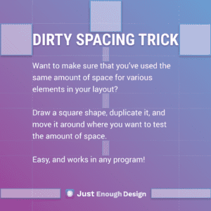
Simple Design Hack – How to give your layout nice spacing
A simple but critical element to ensuring the layout of your work looks great is spacing. One element of spacing that’s easy to measure and has a large impact is the consistency of spacing. Do you have the same amount of space: Around all elements? Between elements? Within elements? It may feel…
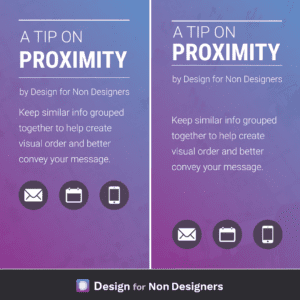
Create better looking work: Proximity
The human eye LOVES order, and you can use this in your work to make your message easier to digest and understand. By keeping pieces of information that are similar, like titles and authors (or subtitles), body copy, contact information etc. together, you lay out a flow and order for your viewer. You’re saying “here…
Answer: What do UX designers just “get” that other people don’t?
Empathy. One of the greatest things a good UX designer taps into is empathy. And this comes out in many ways. Empathy for the end user, the person who will use the product. How can I help them or make their life easier? Empathy for the developers. Can I reorganize my approach here so the…
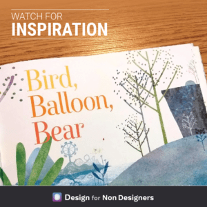
How to be more creative – always keep your eyes open
I was reading a book to my child when the title struck me. Specifically, the nice font, the three words stacked on top of one another, the beautiful colors used. Immediately I began to think how perhaps this could be used as a title page for something else, or perhaps an ad. So using a…
Answer: What are the best apps to learn graphic design in our smartphone?
See the Answer on Quora Since you’re limited in what you can do on a phone, it seems best to use the format to learn from other designers. Loading yourself up with ideas and methods to put into use for future. I’ll suggest four apps you can use to find inspiration and learn from for…
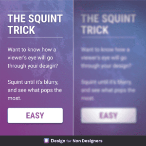
Design Trick for Better Layouts: Squint
A useful little physical trick to help your digital work! If you want to know what element in your layout has the most prominence: look at it while squinting your eyes. This will blur the elements and remove some degree of distraction, and allow you to see what stands out the most. Followed…
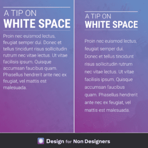
Make any work look better – Add White Space
Making sure that content can breath is one of the most impactful ways we can improve our work. It helps focus attention on the various pieces, it allows for much easier reading, and produces work that feels more balanced and pleasant. Some quick ideas to apply include: adding more space to the left and right…
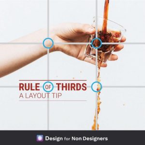
How to make great layouts – Rule of Thirds
A simple layout guide to try if you’ve ever wondered where to place elements in your presentation / document / image. The rule of thirds, which works with both photography and graphics, takes 9 boxes of equal sizes to divide a space into thirds and give you points where the boxes intersect. These boxes give…
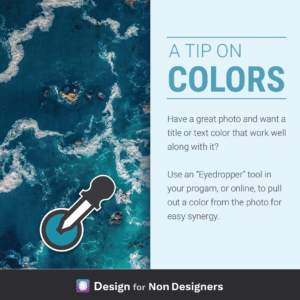
How to find colors for your work or documents
An simple way to find a color that will work with your great photo is to use a color from that same great photo! Either in the program you’re using (like Powerpoint), or with an online tool, simply click around the image until you find a color that that sits well with the image. If…

