Design Answer: Should resumes, unrelated to design, ever be formatted creatively and graphic design heavy instead of plain and professional?


I would argue that no, a resume should never be graphic design heavy.
To use design thinking itself to bolster the argument, what is the purpose of the resume?
To relay pertinent information to the recruiter and show your competency. To introduce yourself and your skill set to the reader and land an in person interview.
Anything that might take away from this goal is against the purpose of design. It becomes decoration in a situation where it is not helpful or appropriate.
Now, there of course is some benefit to having the information laid out in a usable and pleasing manner. I'd suggest the following strike the right balance between efficient and pleasing:
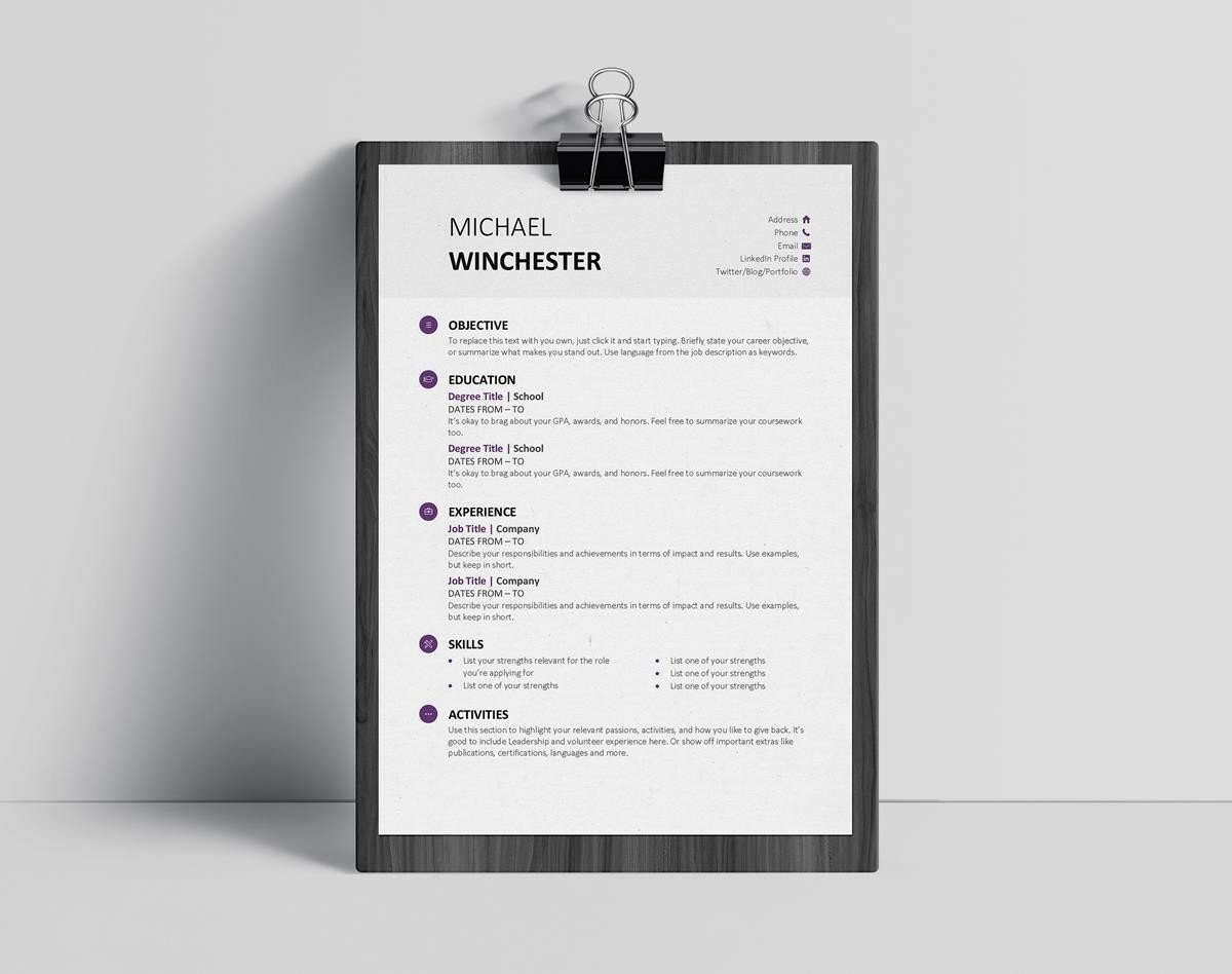

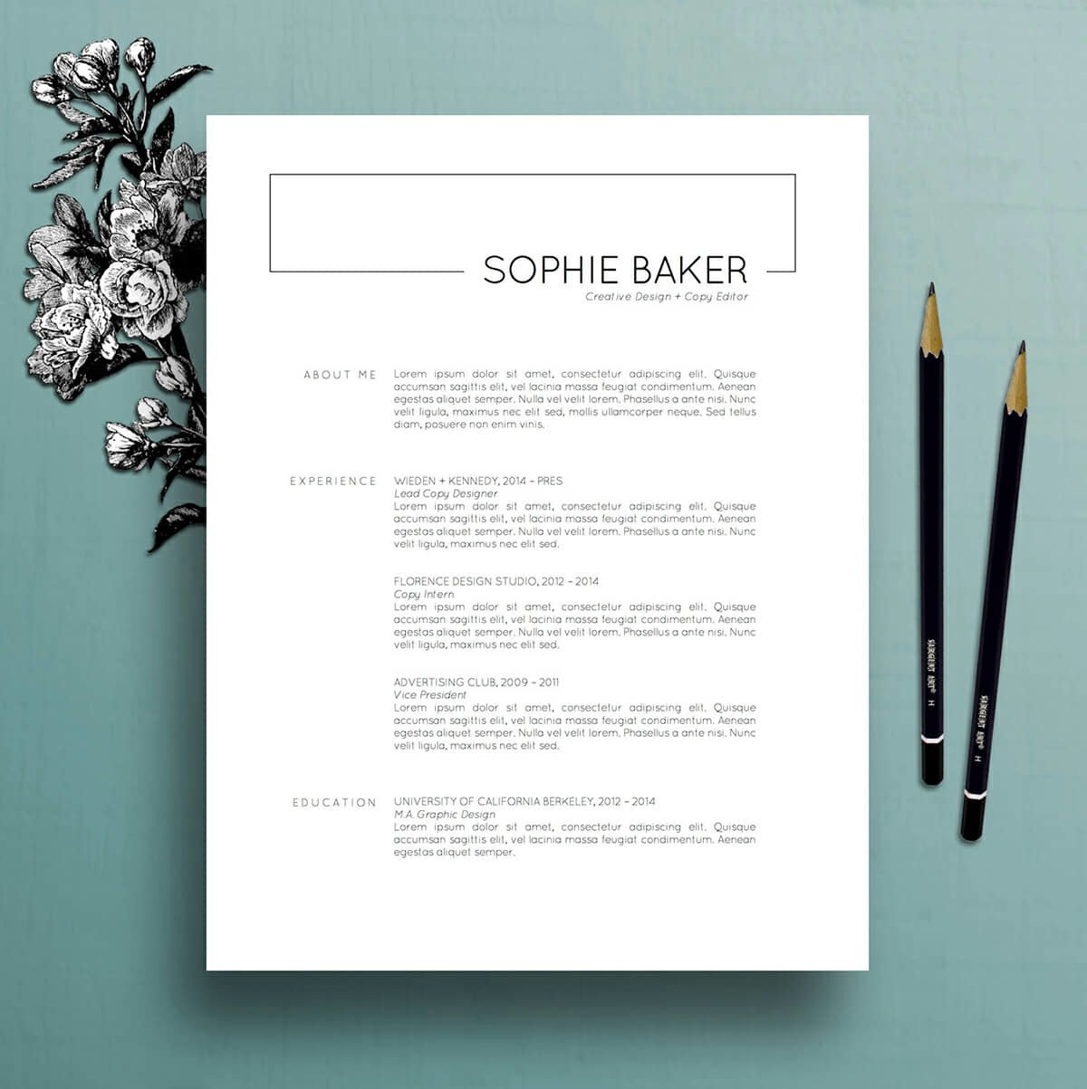

Strong content layout with a bold but understated header.
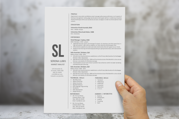

A subtle creative touch with the lettermark / information on the left. The right does feel a little crowded though.
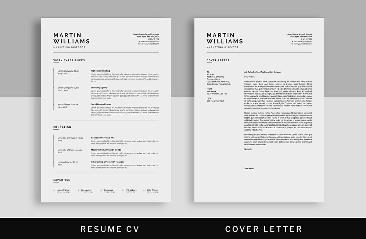

Nothing particularly “fancy” with this example, just nicely spaced out information with nice sections for easy ready.
Cheers to your next great looking resume!
Want more tips like this?
Get them, resources, and more delivered to your inbox: