Use These Easy Guidelines to Significantly Improve Your Website Design


Having a personal website can be incredibly useful for your career. It is a central place under your control where you can send potential employers and clients to see your work. It is free from the noise and clutter of social media, and hyper-focused on your goals.
However, it can be easy for a website to go astray and not have the professional effect you want. Here is a simple set of tips and tricks you can follow for your website that lets you shine through.
Top Trick: Show Somebody


This is "skipping to the end" in a sense, as this truly is the greatest trick you can employ.
Show somebody you confide in your finished website and get their feedback.
This process can be terrifying. But a trusted confidant will provide you with the most comprehensive insight. Watching as an avatar for your future employer or client browses your site and asks questions will reveal to you all the flaws. These won't be obvious to you, as you've worked so closely with it, but an outside unbiased opinion will spot it in a second.
Find someone you respect in a similar industry, hand them a laptop with your site loaded, brace yourself, and take notes. Dig into their feedback and implement good suggestions to enhance your site.
Ask yourself: What is the purpose of your site?


Why do you have a website? What do you want to accomplish with it?
These seem like a lot of questions, but having a solid grasp of your why can help with what.
Do you want to become a thought leader in your industry? If that is the case, you want to showcase your case studies or articles to prove your authority.
Do you want new work contracts? Ensure your service offering is clear, and you have examples of your work.
Do you want to enable people to contact you? Then links to your social media profiles and a contact form are paramount.
Knowing what outcomes you want from the site will help you prioritize the right elements from page to page.
Ask Yourself: Who do I want to reach with my site?
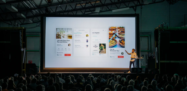

Similar to purpose, you must understand your target audience. How do I want to address them?
For example, the color story, images, and fonts would be different if you are targeting data centers vs. social media specialists.
Your target audience will also impact the "What" of the site if you put yourself in that position and walk through what would be most important to them.
Get Inspired
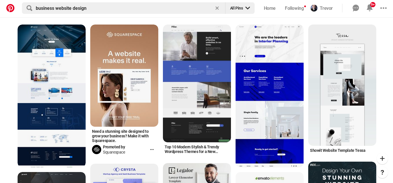

There's no need to go at this alone! There are very successful people with great websites in your industry. They have spent a lot of time testing and refining. Find some excellent examples of your contemporaries and learn from them!
How are they approaching their messaging? What website navigation structure are they using? What fonts and colors do they typically use?
You'll do yourself no favors by doing an exact copy, but with some research into your industry, you'll be able to see some trends and ideas you can benefit from on your site.
Template vs. Custom Design
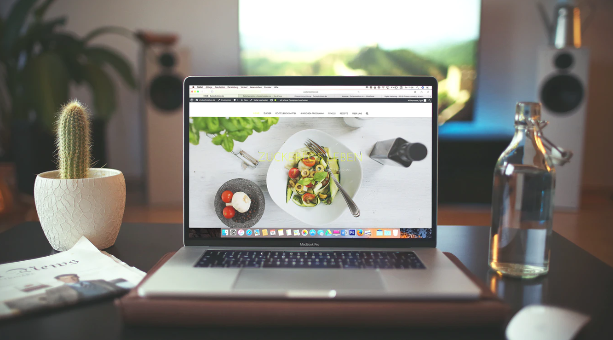

If the site has all the bells and whistles, then you'll end up spending a lot of time polishing bells and tuning whistles. Prioritize solid foundations.
After doing your homework researching your target market and similar sites for inspiration, it is time to decide how your site will look.
Full “hosted for you” services like Squarespace and Wix will have a number of designs to consider, but ultimately there will be less variety to choose from and you’ll be more restricted in your customization. This can be a good thing, though, as you’ll be restrained from ruining the well thought out visuals.
WordPress, comparatively, has a wide range of templates to choose from. The templates range from free to premium. Some of these paid templates can be reasonably priced while others are incredibly expensive. Another option is creating a custom design by hiring a web developer or learning to do it yourself.
The decision to use a template or go custom comes down to a couple of factors:
Who are you targeting, and do they care about the code/design?
If the site is just a repository for your information, the only thing that matters is that the site is easy to navigate, fast-loading, and contains all the mentioned information. In this case, there is not a lot of benefit to toiling over a custom website.
If, however, you're a designer, developer, or someone trying to show their technical acumen, then being able to point to a beautiful and well-built site may be a plus.
It's important to remember here that the site should serve you and your purpose. You don't want to be bogged down with issues that detract from your job/client hunting, so choose this burden wisely.
Mobile Friendly


There are lots of variations and options to choose from for a site, but these days there is one non-negotiable factor: Mobile Friendly.
There is a good chance someone will access your site on their phone. Your website must look great on a mobile device, and be easy to navigate on that form factor.
Keep this top of mind as you're narrowing down your template/style choices.
Stick to known conventions


It can be fun and exciting to try unique and innovative layouts for your website. However, it is a misplaced effort if it doesn't serve your purpose.
Unless you're a designer or developer that would benefit from an amazingly different layout, you'll want to focus on a layout that helps achieve your goals.
We can lean on learned conventions. This is what people have come to expect on websites for all the years they've been online. Holding on to what's known and expected on a website can help people focus their attention on the content, action, and message you want to get across.
This includes:
- Logo or name top left or top center, links to the homepage
- Main navigation top right or top center
- Contact in the menu as the last item
- Social media links in the header or footer
Using known conventions may be a bit boring, but it can make your life and the life of your viewer easier.
Use the Right Images For Your Target Audience


The human brain can process images up to 60,000 times faster than words. It's a powerful tool for us to use to convey to our visitors that they're in the right place.
Since we know who we're targeting and the message we want to say to them, we can use that information to help choose our images.
Find the most relevant images by going back to your Inspiration phase and analyzing the images of similar sites in your niche.
Additionally, take a look at advertising aimed at them and see if there are any common themes.
Consider the experience of the person visiting your site when they see an image. What do they think it would mean? Does this image support the copy and message I'm getting across?
A nice trick is to go on Google and search the market you're targeting or the key phrases you're using. In the Image tab, the site will bring up a lot of images related to the search terms, that may inspire you.
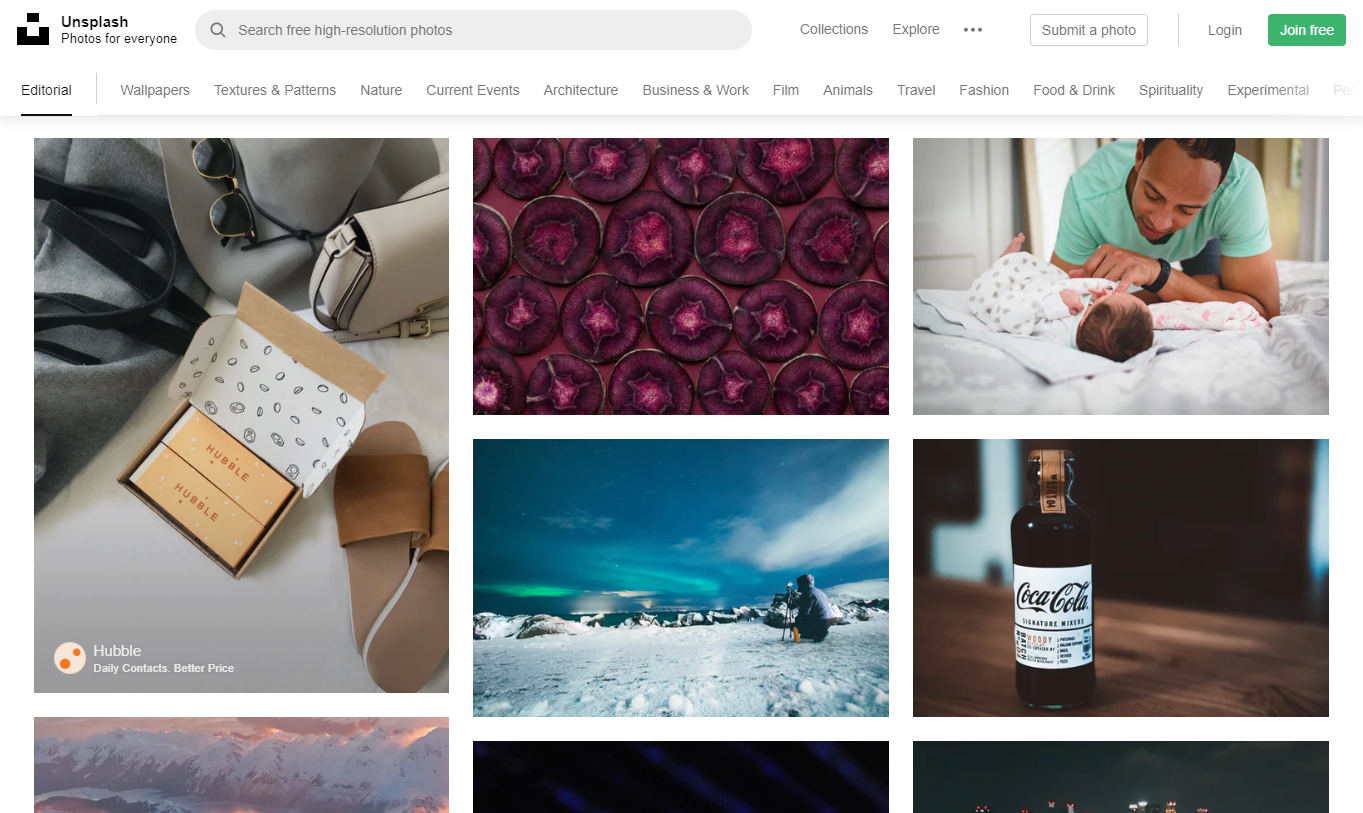
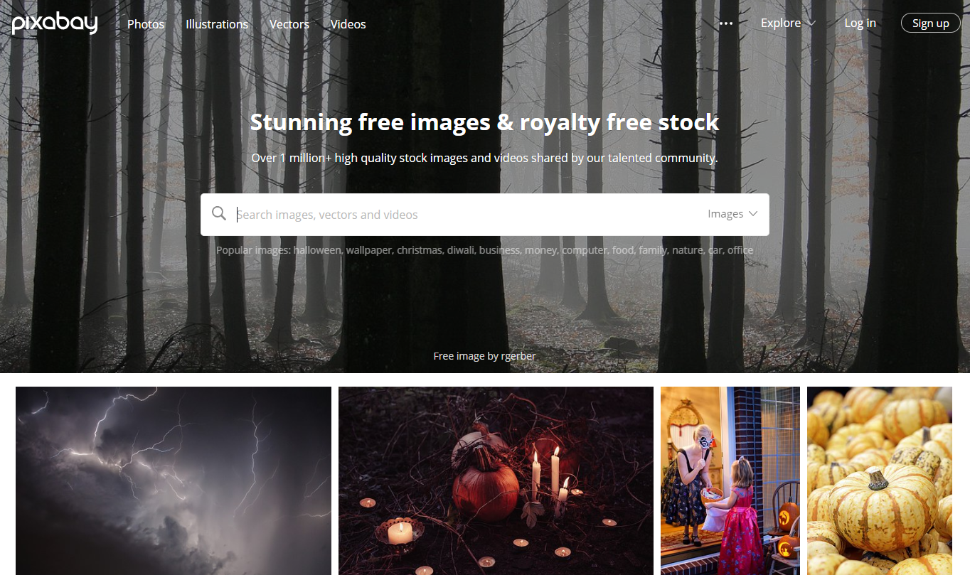
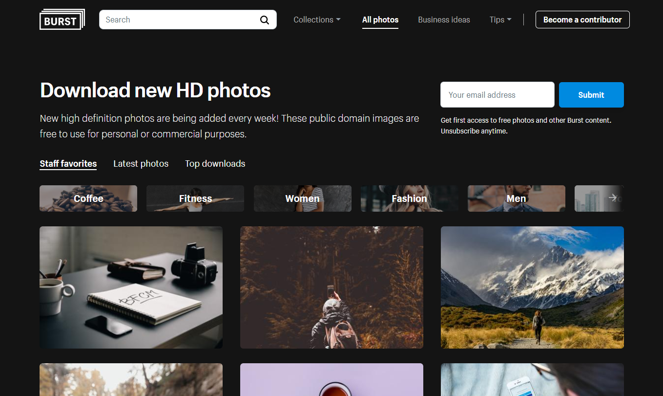
With that in hand, it's time to find some beautiful images. Thankfully, there are amazing sites with exceptional high-quality photos. The best part is those photos are completely free for personal and commercial use. Here are some sources to check out:
Let everything breath


There will always be a desire to fit in as much information as possible into any given space. However, this can be counterproductive.
Think about playing catch with somebody. If you throw 6 balls at them all at once, chances are they won't catch any. Imagine instead softly throwing one ball…it's easy to imagine it being caught.
So it's true with your content. Don't keep adding ideas and verbiage to every page. Choose your words carefully, and allow the brevity and space to give them power.
This helps in achieving a secret weapon in design: Whitespace.
Adding blank space around elements allows the reader to effortlessly digest and transition between pieces of information. Whitespace avoids things from becoming cluttered and congested. It produces an orderly and pleasant reading experience. The eye will flow effortlessly between different sections of the content.
Only Use Two Fonts


We've touched on a principle of "less is more" a couple of times already, but remains the same with fonts.
Use no more than two fonts on your website.
It can be challenging to determine if fonts are compatible with one another. Having too many fonts causes visual confusion in order and meaning.
Using fewer fonts will produce a simpler and cleaner design that your audience will appreciate.
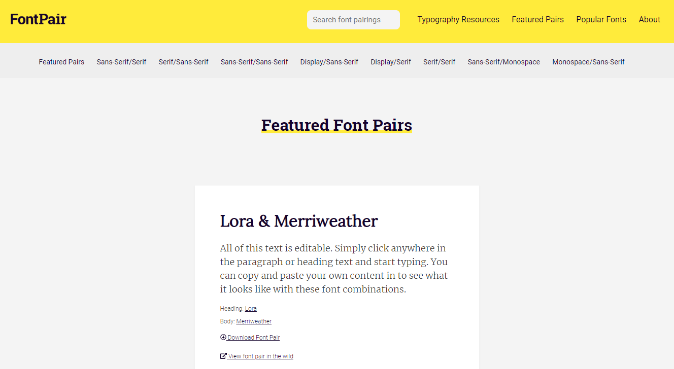
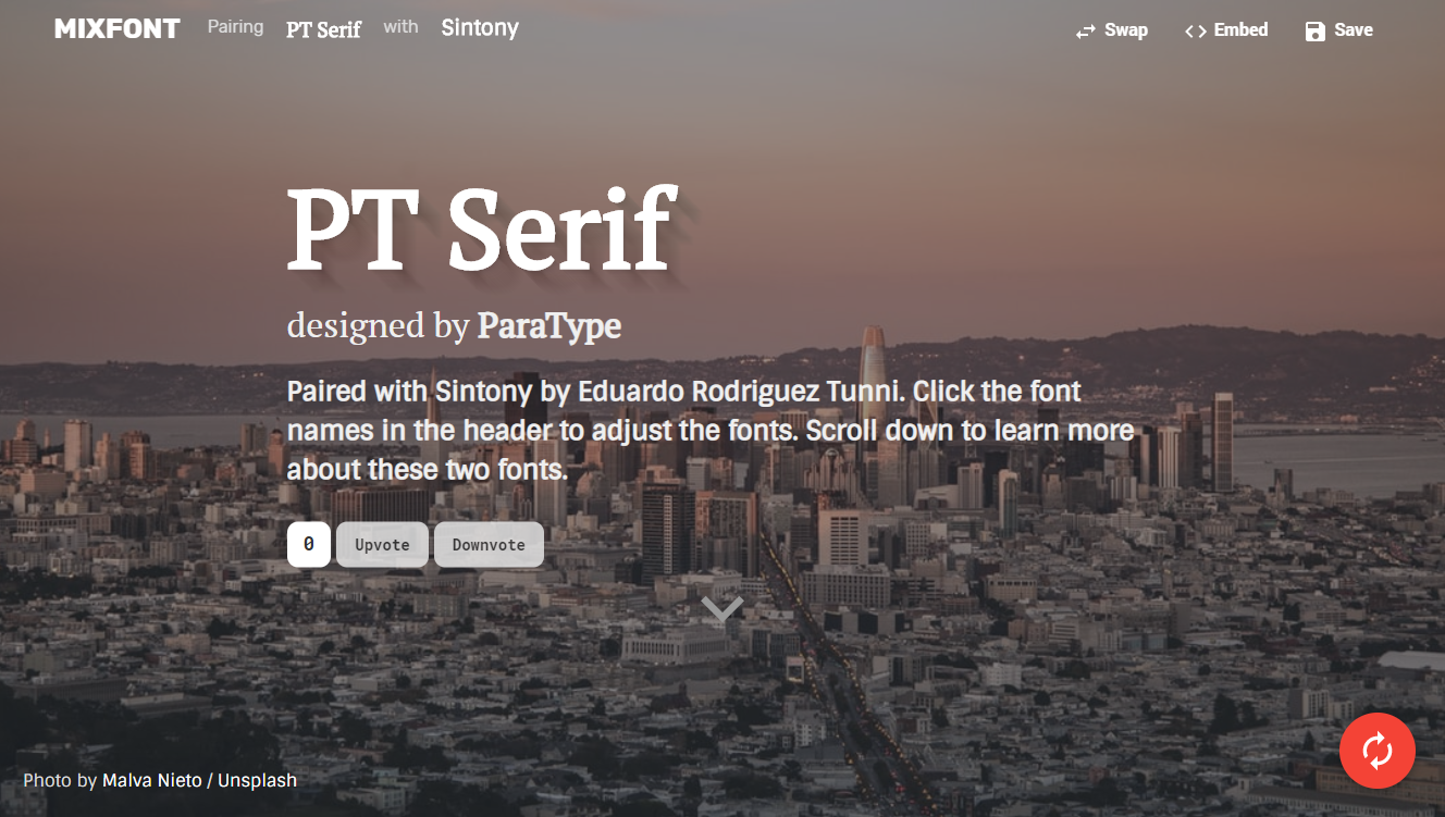
To find fonts that coordinate well together, check out the following free sites:
The added benefit to these sites is that they use Google Fonts. The fonts are completely free to use. They can be embedded in most sites. (Wix and Squarespace use many Google fonts for their service as well.)
Make Links Obvious


If you want your audience to take action, you need a clear call to action. A common mistake on sites are links that are not styled properly.
Links need to be visually different so the reader can tell they are clickable. Greats steps include using a color that stands out and possibly underlining.
To avoid a button looking disabled, You want to ensure button colors are bright and contrasting. Soft or washed out colors can denote a button that isn't active. Make sure they look inviting and alive.
(Once again, peer feedback is useful.)
Use Headers Wisely


Headers (H1, H2, H3, H4, H5, H6) need to be meaningfully different from the body text, and one another. Deploy them wisely to help guide your reader and some bonus SEO boosts.
Think about the Headers like the sections and subsections in a piece. You would organize your content on a page like this:
<h1>Title Here - Only One of These Per Page</h1>
<h2>A Sub Title</h2>
<h3>Point One</h3>
<h3>Point One</h3>
<h4>Small Point One</h4>
<h4>Small Point One</h4>
<h3>Point One</h3>
<h2>A Sub Title</h2>
<h3>Point One</h3>
<h3>Point One</h3>
<h4>Small Point One</h4>
<h4>Small Point One</h4>
<h3>Point One</h3>
Increasing text size makes content organization clear to the reader.
Consider the suggestions below as a starting point to apply the differences in the font sizes. If you'd like to alter them, I'd suggest making the changes larger, not smaller:
| Body Text | 16px | 1x |
| H1 | 40px | 2.5x |
| H2 | 32px | 2x |
| H3 | 28px | 1.75x |
| H4 | 24px | 1.25x |
| H5 | 20px | 1.25 |
| H6 | 16px | 1x |
Limit the Colors


It can be fun to play colors within a design or a website. Keep in mind that just like fonts, things can go wrong fast and have a detrimental effect.
To avoid this, keep things clean and simple. Try limiting the colors you use, possibly one.
Consider reducing the number of shades you use to just a handful. You can use black, grays, and whites.
The benefit of limiting colors is that it would make it easy to guide the user with an eye-catching pop of color. Imagine a page that is primarily grey and white with a bright orange button. Where do you think the eye would go?
Colour theory is a deep and complex topic, but understanding a few basics can help you make decisions for your site.
Each color has emotions tied to them. Even the range of colors can elicit a response. What emotions do you want to convey? Consider using the corresponding colors.
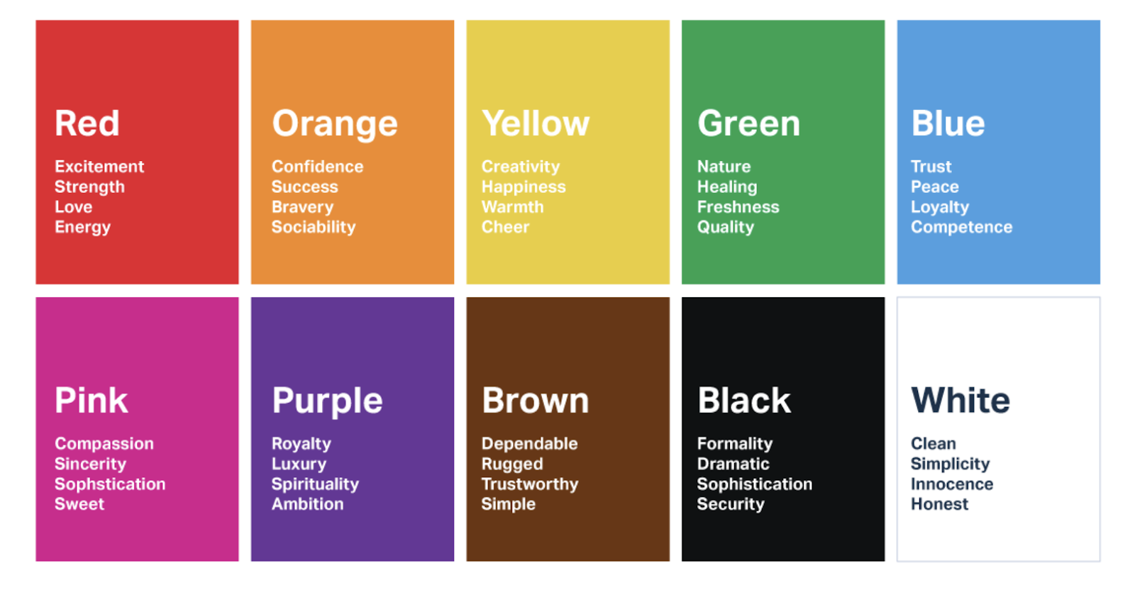

The graphic comes from User Testing and their post on Colours and Conversion Rates:
https://www.usertesting.com/blog/color-ux-conversion-rates/
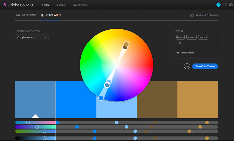
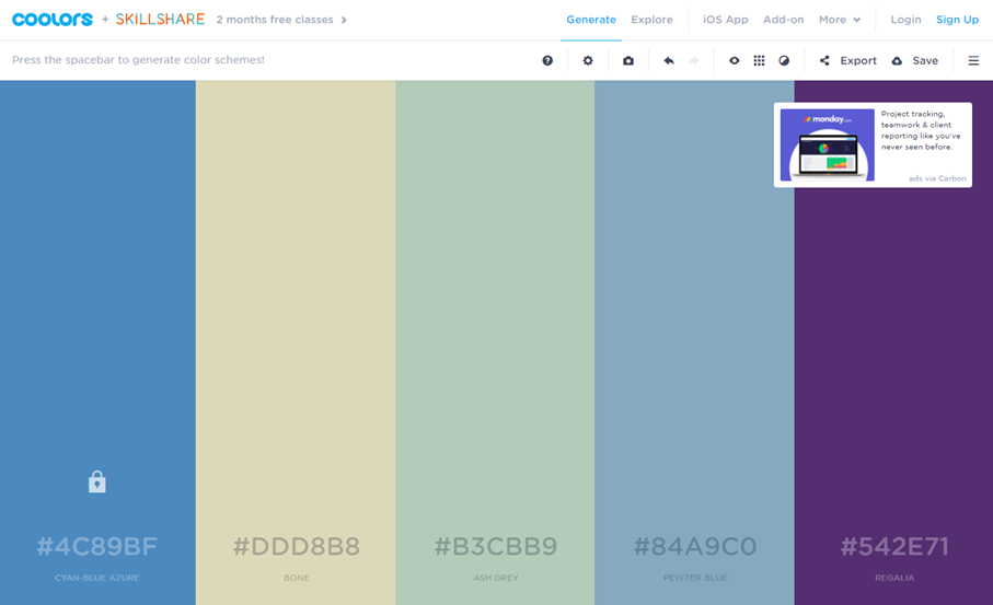
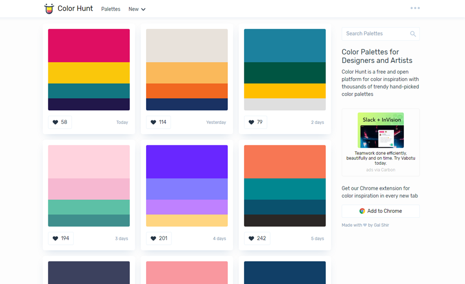
Once you have a few colours in mind, check out the following sites to help you settle on a palette that conforms to colour theory and is cohesive (remember, don't use too many colours):

Types of Content to Add
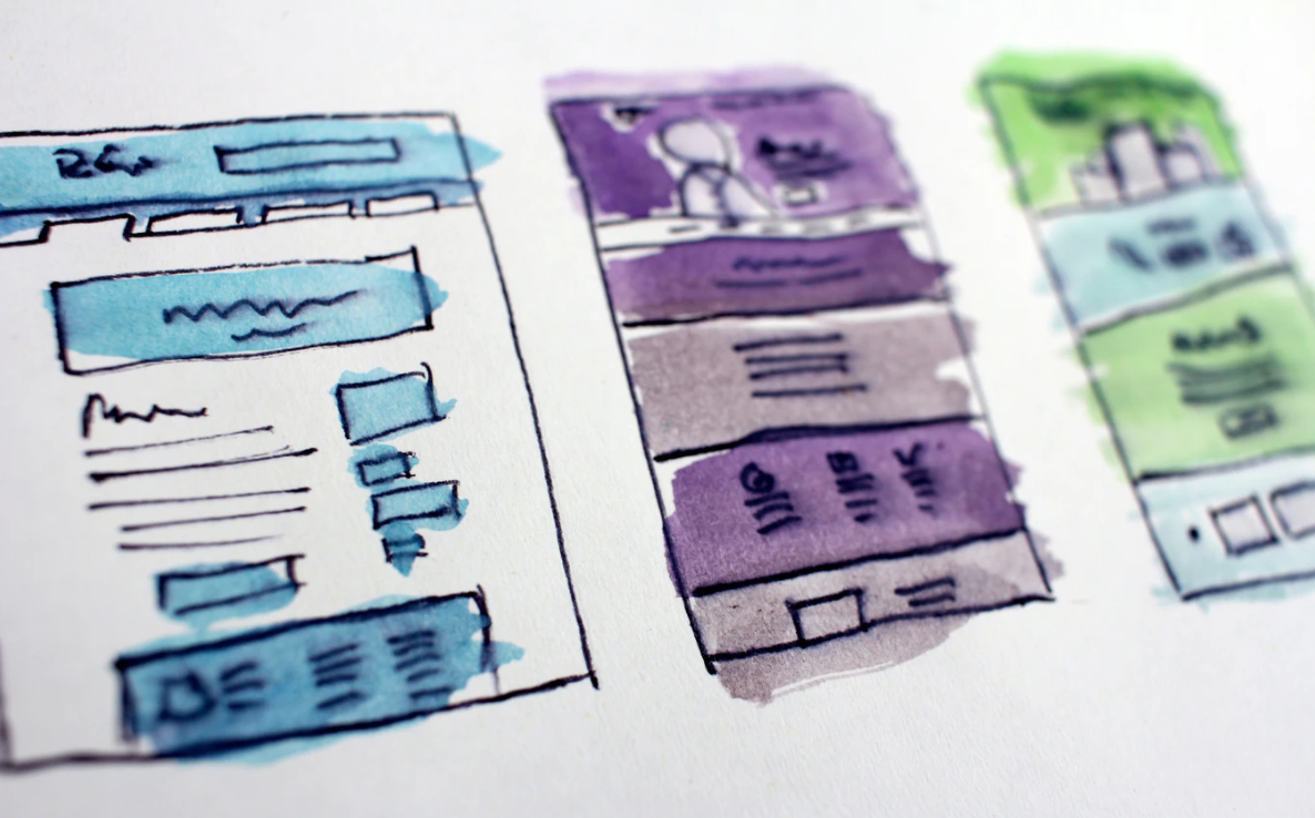

If you work in Systems Administration, a Portfolio may not be the best choice. What you select to put on your site is incredibly important and requires some consideration.
What impresses your target audience? Are they interested in an application portfolio of your previous work? Would they want to review your successful Case Studies?
Think about the audience experience and the content you could add that would capture their interest the most.
Another piece of content to consider is a blog. To blog or not to blog? That's the question.
Posting articles online can be very rewarding for yourself as you become a thought leader. It is also rewarding for readers and your target as they come to understand your expertise. Be mindful of what you post. You can't post about anything. Keep your blog professional as a future employer may stumble upon it. Consider if this is a practice you'll be able to continue in the long term. A blog that has not been updated for a year or is empty looks terrible on a website. You need to ensure you will be able to commit to it.
(Small tip: If your content could be considered timeless, remove the dates from the posts. Quality over quantity.)
Link to where you want them to connect with you
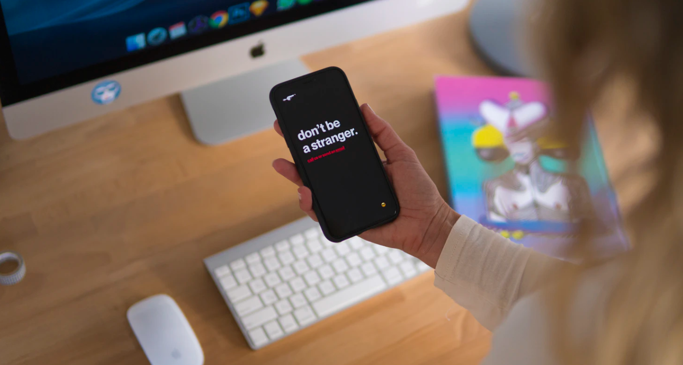

You need to ensure that your visitors can reach you so that you can avoid your visitors going on the hunt for details on how to find you. After all, this is one of the primary reasons for having a site.
As mentioned previously, stick with convention and have "Contact" in the top menu. It's also a good idea to have the contact page listed in the footer along with your social media handles if you'd like an audience there.
Web crawlers can grab your email address and fill your inbox with spam. Instead of listing your full email, it is a better idea to have a contact form should they want to reach you.
Make your website yours


Follow these guidelines and you're sure to have a professional website that helps achieve your goals. Regardless of the platform or style you choose, your audience will appreciate if you stick to the foundations listed above.
Cheers to your great looking website!
Want more tips like this?
Get them, resources, and more delivered to your inbox:
