Simple Design Hack – How to give your layout nice spacing


A simple but critical element to ensuring the layout of your work looks great is spacing.
One element of spacing that's easy to measure and has a large impact is the consistency of spacing.
Do you have the same amount of space:
- Around all elements?
- Between elements?
- Within elements?
It may feel like you need a "designer's eye" to discern this. But there's actually an super useful trick you can use in any program.
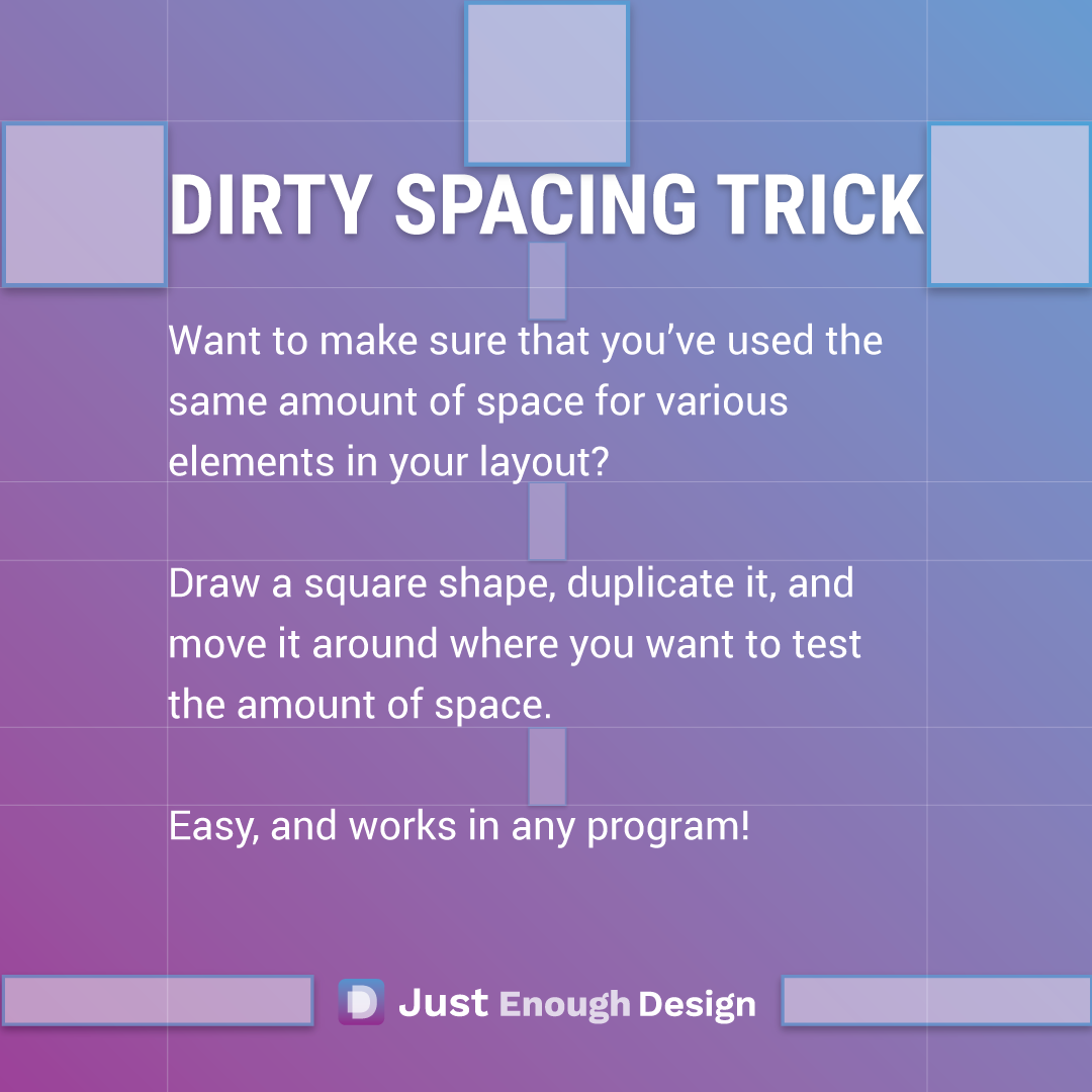
The Square Spacer Trick


Take the square shape tool in the program you're using and draw a square within the space you're measuring. This is now your ruler!
Take that square and duplicate it, placing it wherever you want to check if the spacing is the same.
You can do this many times to many different space situations in your layout.
I tend to use this trick daily while designing a presentation or document. It's definitely one that can work it's way into your....well...work.
Cheers to your next well spaced design.
Want more tips like this?
Get them, resources, and more delivered to your inbox:
[…] (want some guidelines to ensure your slides have impact? Check out the guidelines on Using Fonts, Reusing Design Elements, and Layouts with Nice Spacing) […]