How to Place Text on an Image


Quick tip to ensure your text is legible if being placed on top of a great photo.
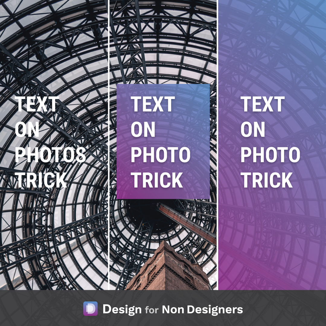
If the text doesn't stand out enough on it's own against the photo, consider adding a slightly transparent colored square behind it!
You can either place a square just around the text (though be sure to add a little space between the letters and the edge to let everything breathe).
Or you can consider adding a colored block on top of the entire photo for a bolder effect!
The slight transparency can be really nice touch, ensuring the viewer can see a little bit of the photo and helping everything meld together nicely.
Some other options to consider:
- cover up 1/2 or 1/3 of the photo to place text
- have the colored block continue off one of the edges
- have the block on an angle to create drama
What's great about having some design knowledge and design tricks in your arsenal is the ability to problem solve when visual situations arise. You'll have tools and techniques ready to ensure your audience receives your message (and is wow'ed to boot 😉)
Cheers to your great looking work!
Want more tips like this?
Get them, resources, and more delivered to your inbox: