Create better looking work: Proximity


The human eye LOVES order, and you can use this in your work to make your message easier to digest and understand.
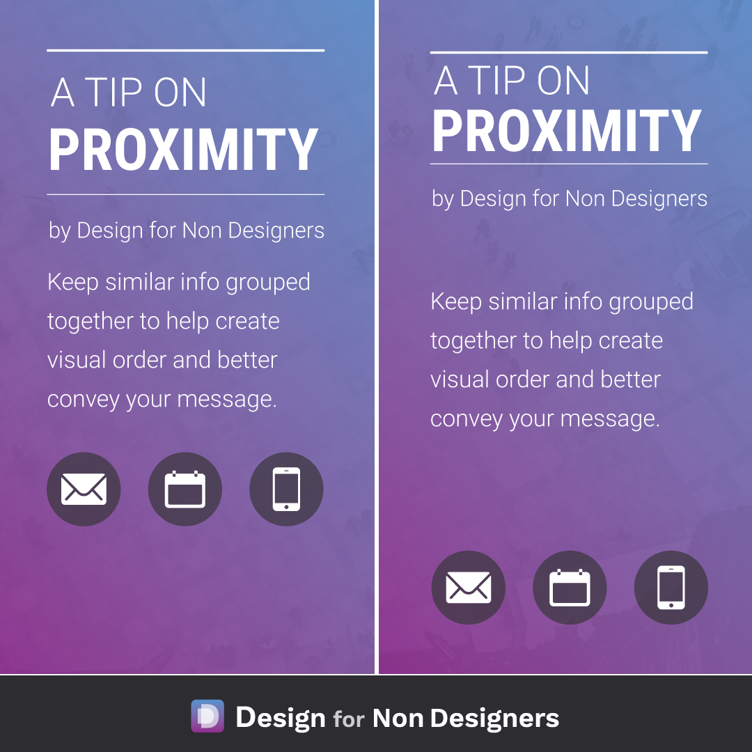
By keeping pieces of information that are similar, like titles and authors (or subtitles), body copy, contact information etc. together, you lay out a flow and order for your viewer. You're saying "here is all of THIS type of information, and over here is THIS type of information".
As you can see in the example, it's a tweak that can have a large and positive impact in your work.
Cheers to your great looking work!
Want more tips like this?
Get them, resources, and more delivered to your inbox: