Design Tips
Layout Options for Your Next Presentation / Document / Post
Do you draw a blank when looking at a blank screen for a post, a presentation, or a document? When it comes time to lay out your content, is it hard to know what to do? True story, most designers often get this sense of dread as well! But, they have 2 tricks at their…
Read MoreDesign Layout – A Tip On Focus
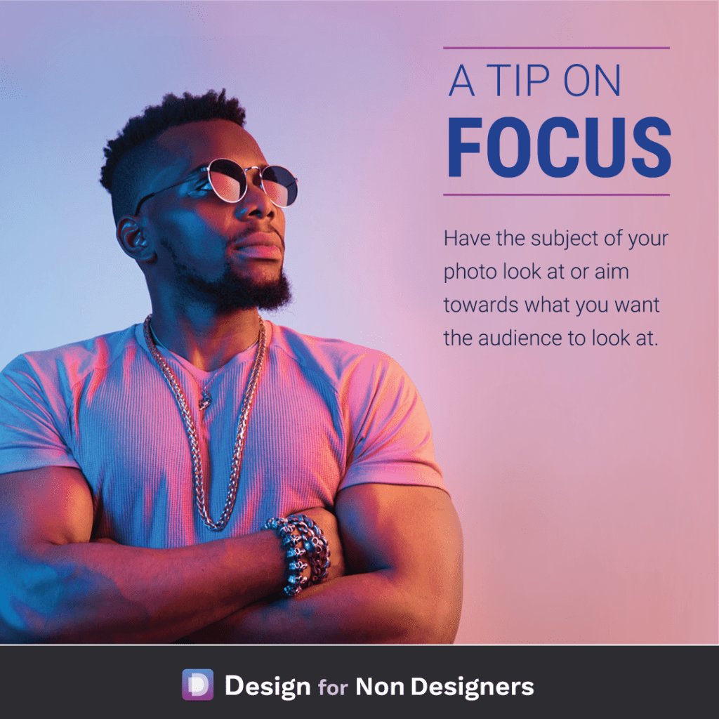
Have you ever caught yourself stopping to stare at what everyone else is looking at? It’s a natural human reaction, and one that we can use in our work to help direct our audience where we want them. Specifically, when we’re choosing photos that have a person, we can ensure they are looking towards where…
Read MoreInspiration for Design: How to design better work
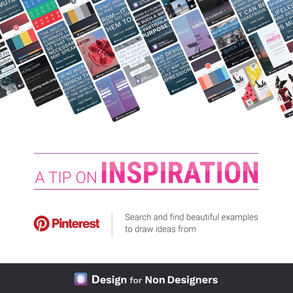
A truth of design is that so much of it is the act of inspiration. The act of finding interesting or cool ideas from other designers and mixing that for your own work. Creative ideas so rarely pop into a designers head. Rather they’re inspired from what others are doing and connecting the dots. What’s…
Read MoreHow To Find Great Font Combinations To Make Your Work Beautiful
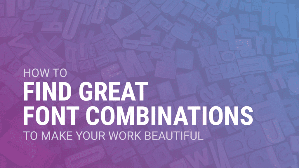
Are you intimidated by fonts and don’t know where to start? Do you just use the default fonts in your presentations and documents but wish you could make things more beautiful? You’re not alone, and thankfully with some great free tools and resources it can be easy to make your documents more professional and enticing.…
Read MoreAnswer: What are the best videos online or offline to learn more about interaction/product design for the web?
Human Factors International offers a great series of videos on YouTube around User Centered Design and Usability. You can find their videos here: http://www.youtube.com/user/HFIvideo?ob=0&feature=results_main The HFI Animate series they do is especially engaging to watch. One of the better examples can be found here: Want more tips like this? Get them, resources, and more delivered…
Read MoreAnswer: How can I differentiate Online products vs “Offline” products on a website?
There would be a number of options you could consider, and I think the best answer will depend on the flow of your site. Option 1, your idea for having two tabs is not a bad one. Calling one ‘In Store’ and the other ‘Buy Online’ (or whatever combination of words work for you) will…
Read MoreAnswer: What Microsoft Office program is best for making an infographic?
PowerPoint could serve this purpose nicely. You’re able to change the size of the slide, and output it as any number of formats (image or pdf, for instance). In the most recent versions Microsoft has done a lot to improve the way it works with images (alignment, cropping, effects), as well as design assistance like…
Read MoreAnswer: Will user interfaces eventually be automated largely by machine learning?
I believe so, yes. If I said “design me a list view”, or “design me a profile page”, immediately a couple common design layouts likely come to your mind (think Facebook / Twitter and their layouts for both). Since there are established patterns for a majority of needed interactions, it’s not a far jump to…
Read MoreAnswer: What are some examples of graphic design software that I can easily learn at home?
For Desktop software, take a look at Adobe XD. It’s a full UI / UX design program from Adobe, and completely free. It’s most comparable to the design app Sketch (on the Mac), and is quickly gaining traction and new features. There are some good tutorials for using it on Youtube, and if you become…
Read MoreAnswer: How can I be more creative?
Yes, everyone is able to ignite creativity within themselves. It’s important to remember, though, that creativity is not limited to the arts (painting, drawing, sculpting, etc). You can see creativity in science, business, and management through finding new paths, strategies or theories. Creativity is not only defined by the stroke of a brush and you…
Read More


