Design Tips
Most Common Image File Types: Your Ultimate Guide
Did your designer send you a whole bunch of files after you approved the design, but you don’t know why? While the design may look the same in all those files, there are subtle differences that can ruin the quality of your work if you use the wrong format. That’s why in today’s post, I’m…
Read MoreWhy Everyone Should Know a Little Design
Whether you’re a manager, a small business owner or an entrepreneur, there’s one thing we all have in common: wearing multiple hats throughout the day. At one moment, we’re the visionary setting the destination of the journey. At another, we’re the manager overseeing all day to day activities to ensure everyone is following the plan.…
Read MoreDesign Help: Guide to Working With a Designer
Nobody is great at everything – especially when it comes to running a business or online storefront. In fact, there is already so much that you must be concerned about that sometimes the design factor is pretty far down at your to-do list. And, really, that is quite the mistake. Think about it: often the…
Read MoreUse These Easy Guidelines to Significantly Improve Your Website Design
Having a personal website can be incredibly useful for your career. It is a central place under your control where you can send potential employers and clients to see your work. It is free from the noise and clutter of social media, and hyper-focused on your goals. However, it can be easy for a website…
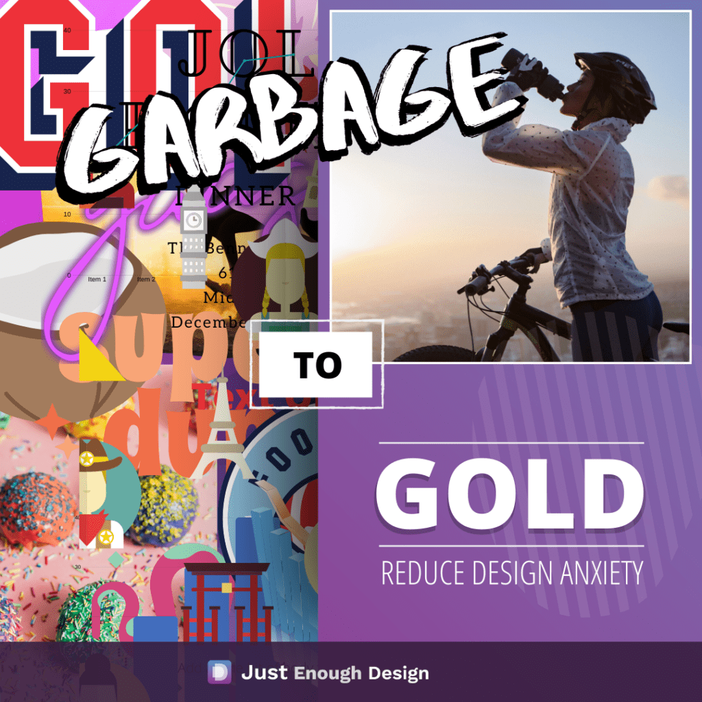
Read MoreGarbage to Gold – Reduce Design Anxiety and Unlock Creativity
Studies have shown that if you are anxious your creativity diminishes. This can be a problem as you attempt to create great looking work. Especially when it comes to using applications you do not feel comfortable with. Many applications like Google Slides or Canva come with some very powerful features. Almost endless options…
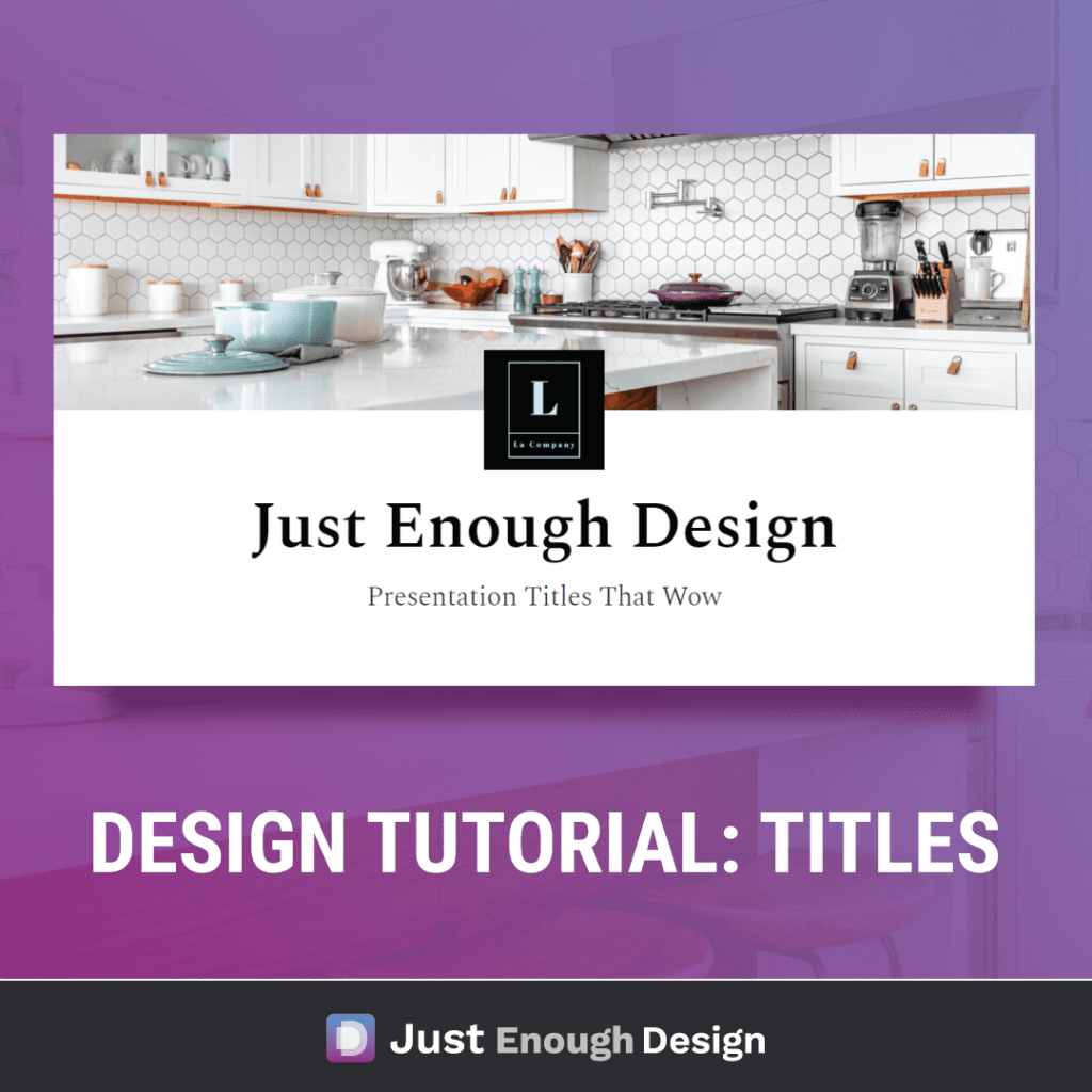
Read MoreDesign Tutorial: How to Create Powerful Titles
Recorded a tutorial on how to create a powerful title. For this we lean on some classic layouts as a base, then play around to see where we arrive. (Spoiler: the winning layout is one I hadn’t even thought of when I started!) Take a look and let me know if you have any go…
Read MoreDesign Trick: Gradient Cut-Out with Canva
Subscribe to my YouTube Channel for more Ever looked at a design and wondered “how did they create that?” The answer to that question can be much simpler than you think! This design was created in Canva using simple tricks. They’re easy to apply and useful for a variety of different effects you may like…
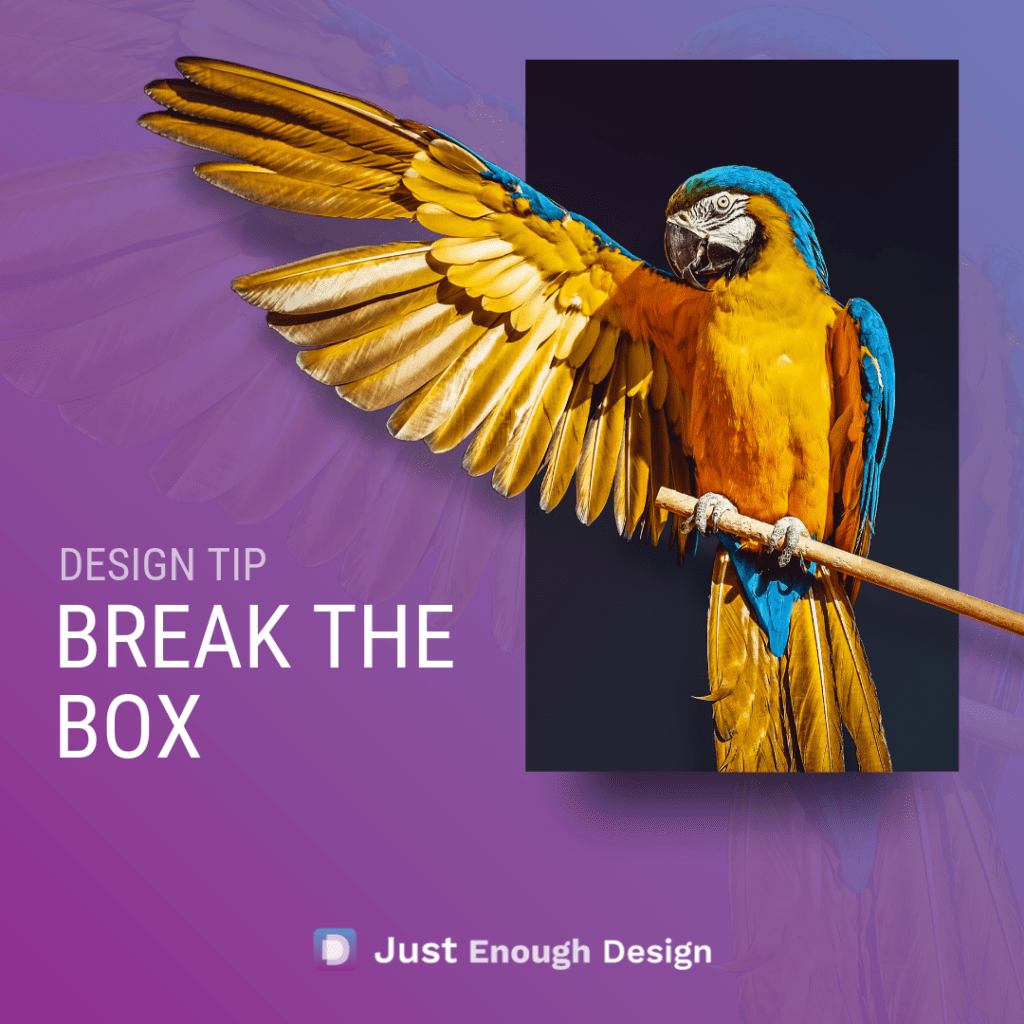
Read MoreCanva Designs – Guide to create a stunning “Out of the Box” Design
Let’s break your design out of the box! Having an element “break out” of another is a great trick to create visual interest in your work. It subtly subverts expectation and offers a small visual surprise to the viewer. To achieve the affect, all you’ll need is: An image of an object…
Read MoreDesign Guideline: Create Better Designed Work with Double and Half
Want a quick gut check method to ensure the work your producing looks and works great? A lot of design comes down to simple concepts, and the Double and Half method helps to simplify the ideas. The idea has it’s foundation in Drama, or Contrast. An idea that things need to be different enough from…
Read MoreHow to check if your design is good
Asking whether a design is “good” or not can sound subjective, but there is a lot that is quantifiable. You know your target, and you know what you want to say to them. There are online tools that will tell you if one font works with another. And even more tools to tell you colors…
Read More
