Creativity
Design Tutorial: How to Create Powerful Titles
Recorded a tutorial on how to create a powerful title. For this we lean on some classic layouts as a base, then play around to see where we arrive. (Spoiler: the winning layout is one I hadn’t even thought of when I started!) Take a look and let me know if you have any go…
Read MoreDesign Trick: Gradient Cut-Out with Canva
Subscribe to my YouTube Channel for more Ever looked at a design and wondered “how did they create that?” The answer to that question can be much simpler than you think! This design was created in Canva using simple tricks. They’re easy to apply and useful for a variety of different effects you may like…
Read MoreHow to check if your design is good
Asking whether a design is “good” or not can sound subjective, but there is a lot that is quantifiable. You know your target, and you know what you want to say to them. There are online tools that will tell you if one font works with another. And even more tools to tell you colors…
Read MoreHow to be more creative – Expand with the 100 Idea challenge
As the name suggests, this hack to be more creative involves coming up with 100 ideas. Literally. 100 ideas to solve 1 single problem. Why so many? Well, it comes down to how we often approach coming up with solutions to a problem. The brain by nature can be a bit lazy. When…
Read MoreLearn Graphic Design: Play with basic shapes
Basic shapes may seem, well…basic, but by playing around with them you can greatly enhance your work. ⠀⠀⠀⠀⠀ If a layout needs an extra visual punch to command attention, try placing a shape or two behind the content. Try a different color, a different orientation, or anything else your mind comes up with. Allow yourself…
Read MoreDesign Answer: How can I learn to build cool websites?
Question: “As an independent front-end developer, how can I learn to design cool websites? I imagine the design in my mind and code it so it becomes bad. I feel that UI design courses learn you how to use the software like XD only, not the cool design itself.” Having a desire and curiosity are…
Read MoreAnswer: What do UX designers just “get” that other people don’t?
Empathy. One of the greatest things a good UX designer taps into is empathy. And this comes out in many ways. Empathy for the end user, the person who will use the product. How can I help them or make their life easier? Empathy for the developers. Can I reorganize my approach here so the…
Read MoreHow to be more creative – always keep your eyes open
I was reading a book to my child when the title struck me. Specifically, the nice font, the three words stacked on top of one another, the beautiful colors used. Immediately I began to think how perhaps this could be used as a title page for something else, or perhaps an ad. So using a…
Read MoreDesign Trick for Better Layouts: Squint
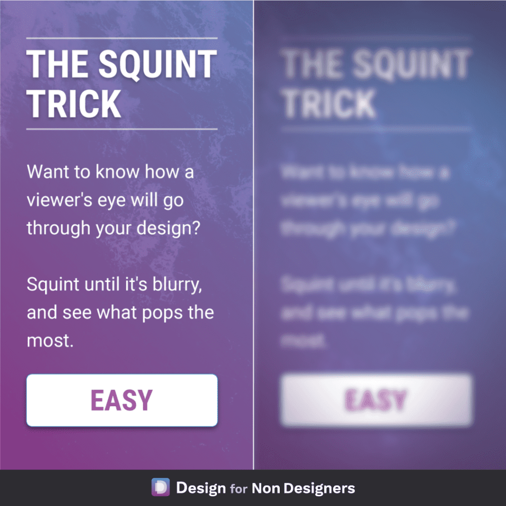
A useful little physical trick to help your digital work! If you want to know what element in your layout has the most prominence: look at it while squinting your eyes. This will blur the elements and remove some degree of distraction, and allow you to see what stands out the most. Followed…
Read MoreTip for Better Design – Control the Viewer’s Path
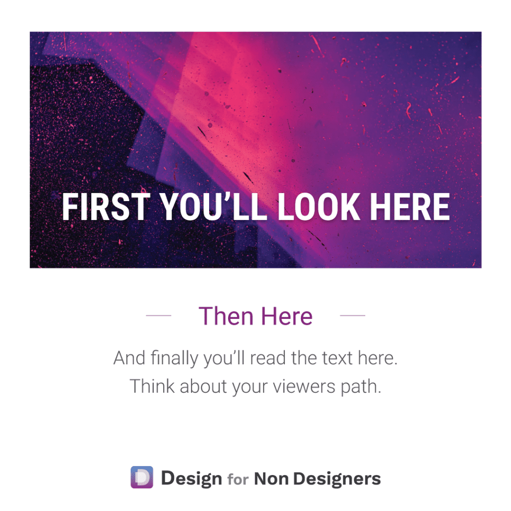
We’ll often hear of the need to tell a story when we’re trying to present something or sell something. But often that only goes as far as the words. With visuals, the flow and reveal can be just as important. When you look at your pitch deck, your document, your ad: what do you want…
Read More