Design Trick for Better Layouts: Squint


A useful little physical trick to help your digital work!
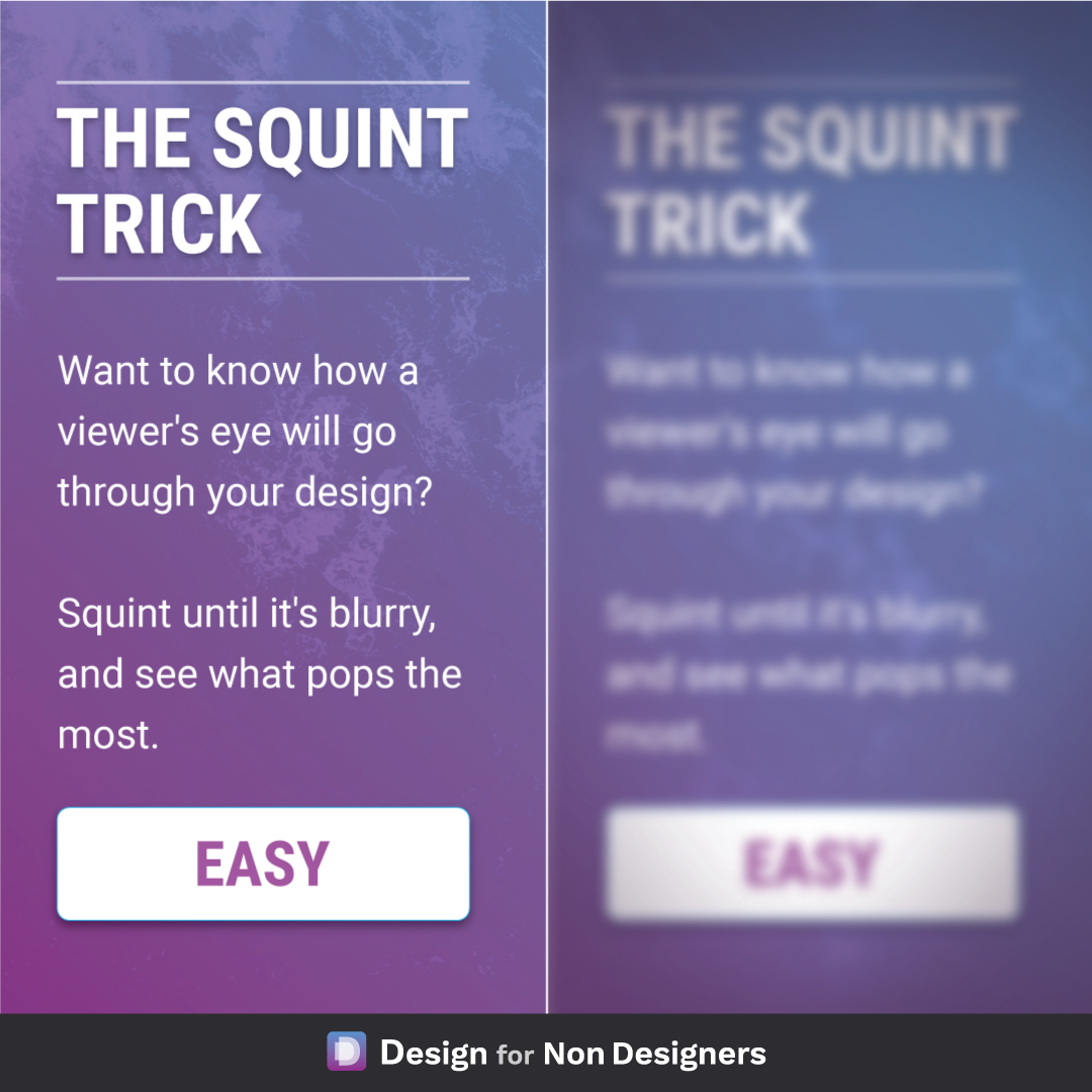
If you want to know what element in your layout has the most prominence: look at it while squinting your eyes.
This will blur the elements and remove some degree of distraction, and allow you to see what stands out the most. Followed by second most, third most etc.
Before the "squinting" phase, you can be ahead of the game by using ideas of Focus and Controlling the Users Path. But as your finalizing your work and want to ensure you send users where you want to, it's a quick simple trick.
Cheers to your well focused designs!
Want more tips like this?
Get them, resources, and more delivered to your inbox: