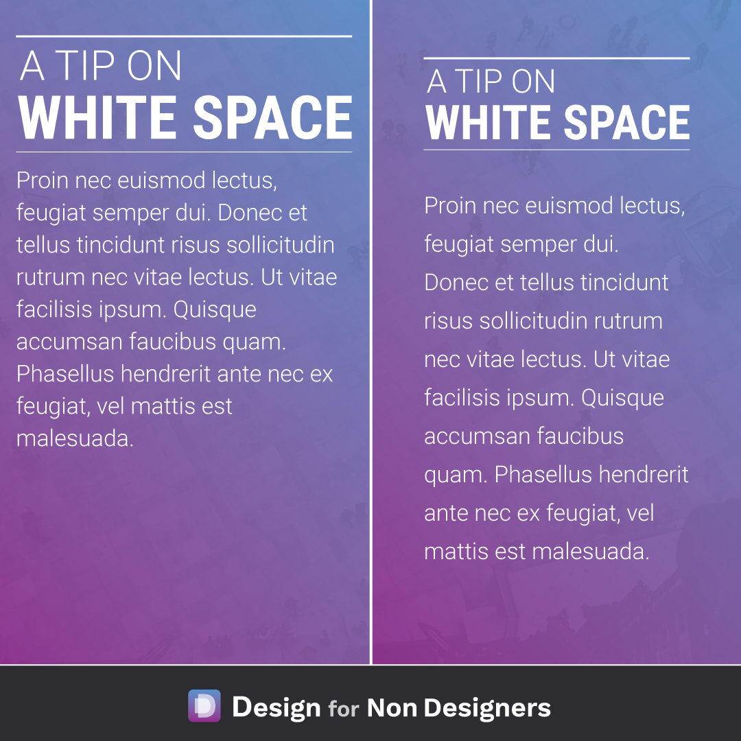
Make any work look better – Add White Space


Making sure that content can breath is one of the most impactful ways we can improve our work. It helps focus attention on the various pieces, it allows for much easier reading, and produces work that feels more balanced and pleasant.
Some quick ideas to apply include:
- adding more space to the left and right of the content, which improves it's focus and makes it nicer to read
- having a line height between 125% to 150% of the font size
- ensuring each piece of content, like titles and body copy, hav comfortable space between them
When trying to improve the appearance of your work, remember to let it breath with some white space.
Want more tips like this?
Get them, resources, and more delivered to your inbox: