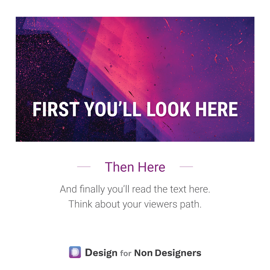
Tip for Better Design – Control the Viewer’s Path


We'll often hear of the need to tell a story when we're trying to present something or sell something. But often that only goes as far as the words.
With visuals, the flow and reveal can be just as important.
When you look at your pitch deck, your document, your ad: what do you want the audience to look at first? (The amazing headline? The beautiful product shot?)
What do you want them to look at next?
By carefully choosing your colors, sizes, and images, you can bring your viewer through your content bit by bit, controlling their journey and supporting the message you want to get across.
Rather than just trying to make something "look good", with the right application and know how you can direct your audience through your work, just like a great story. 📘
Cheers to your visual story telling!
Want more tips like this?
Get them, resources, and more delivered to your inbox: