How to Understand ANY Website Builder – Elementor, Squarespace, Wix, and More

It is an amazing time right now to build a website.
We are spoiled with choices when we need to build something online to represent our business. Beyond coding something by hand, the new world of Website Builders has opened up the simple creation of websites to everyone!
With fully hosted options such as SquareSpace, Wix, Weebly, WordPress.com, and Jimdo, you can create and customize while having all the hosting and coding done for you.
Meanwhile, self hosting a WordPress site has gotten easier and easier, along with the creation of custom designs with layout builders like Elementor, BeaverBuilder, and Divi.
Does the thought of learning one (or more) of these systems worry you though? Have you tried one of them before but found yourself lost?
Fear not! What I want to walk you through today is a different way to approach these builders. And I do mean “these builders”. I want to talk about a methodical way of approaching any website builder you may use that will help in taking it apart and coming to understand it.
Instead of trying to study and become an expert in one builder, we’ll discuss how to think about website builders as a whole so you can have a foundation for ANY website builder.
This is by no means a deep dive, but it will give you a useful frame of reference to feel confident in any website builder you try in future.


The Box Method
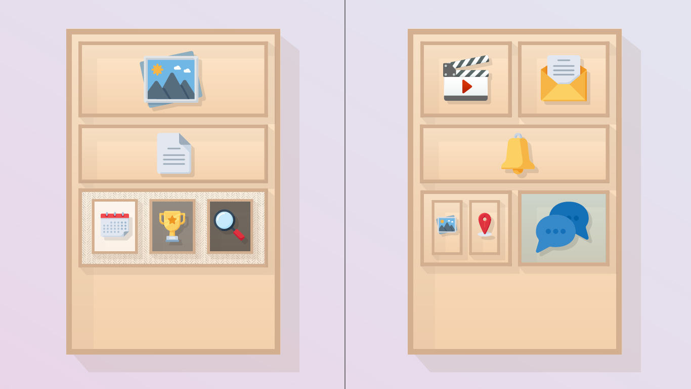
I’d like you to imagine a large tall box on your floor. This will represent the browser and what your visitors will see.
The way that all website builders work is to place other boxes within this large main box.
We stack boxes on boxes, and we even go so far to add boxes within other boxes to give us the different shapes and sizes we want.
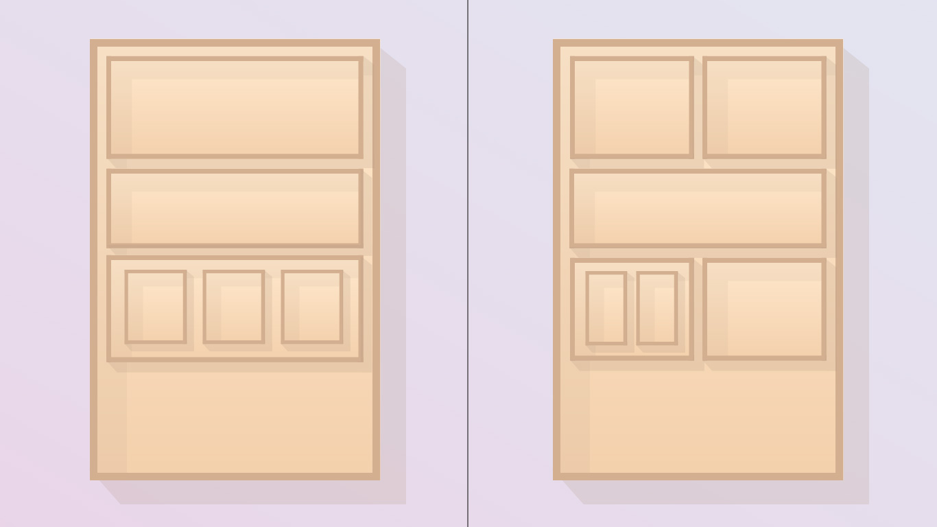

These could be called “Rows”, “Columns”, “Containers”, “Areas”, or any other number of naming conventions, but the main truth remains when using a website builder:
You start with a series of boxes, stacked on top of one another and placed within one another, to create the layout of your website.

Each Box Has Options
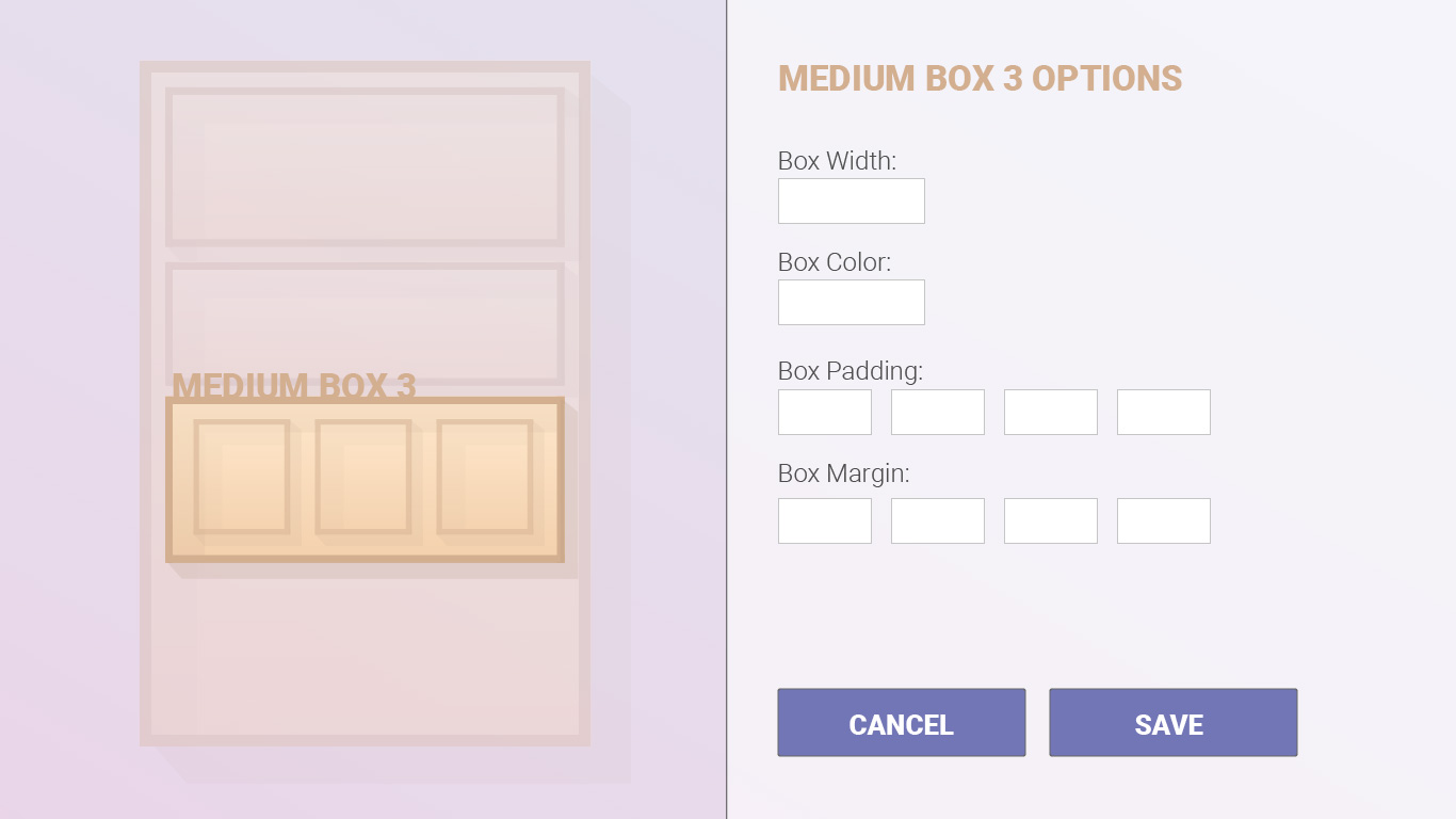
An important idea is that each box that you add can have it’s own styles and options (often called settings). In our example let’s say we added one wide box and three smaller boxes side by side within it.
The three smaller boxes we each paint a different color: white, grey, black.
Then, the larger box behind it, we paste some wrapping paper.
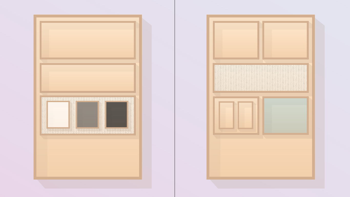

What we’re doing, in Website Builder speak, is changing the “settings” for each of those boxes: the settings of each individual box, and the settings for the box that contains the three.
There will be any number of settings we can change, like background, spacing, visibility, etc., but most crucially is to understand it’s boxes within boxes, and that each can have it’s own settings you choose.

Items In Boxes
We now have our original large box (our web page), and a number of other boxes stacked and placed within one another.
We can now add items into any of these boxes. Items like a photograph, some text / letters, or buttons.
Just like physical boxes, anything we try to add into a box will need to fit within those boxes. So if the letters we add to a box are too wide, we’ll need to reduce their size or have them go down multiple lines.
True for a photo too. If we place a photo into a box, it’ll need to fit within the width and height of the box.
This is how we build out the content for a web page using a website builder. We add content into boxes, and shift around everything to make it look good.
Think of a common website banner. There is a wide box that contains a background photo, then perhaps 2 boxes within that, each taking up about 50% of the space. We leave the right box empty, then add text and a button to the left box.
We structure everything with boxes, then added content into the boxes.

Each Item Has Options
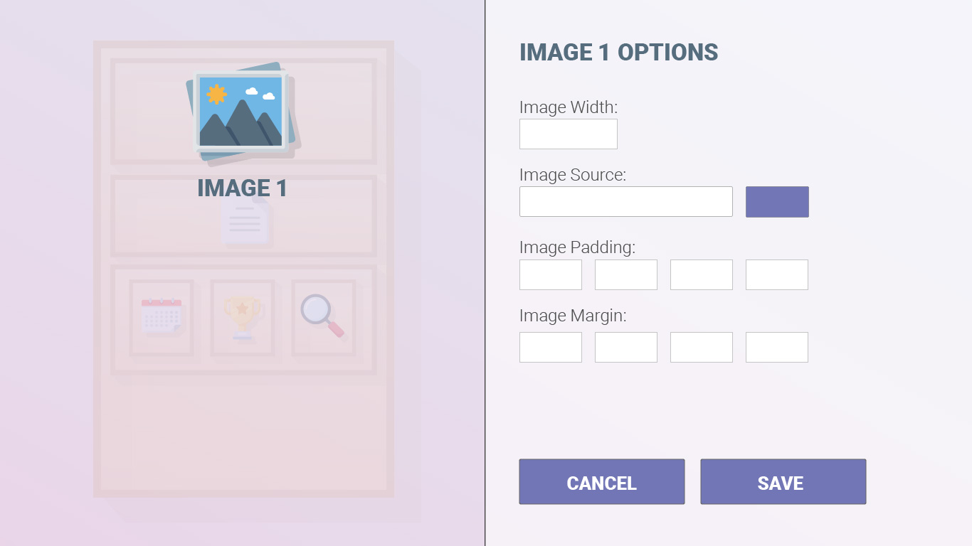
Exactly like the Boxes themselves, each item we add will have their own options (also often called “settings”).
For any letters / text we add, we’ll have options to change its size, color, font, spacing and more. For an image, we’ll have options to choose how it appears, if it gets cropped at all, etc.
This is important, because as we build your site we’ll want to make changes and will need to ask: “What content is this? Why does it look like it does? Where are these options set?” But armed with this new understanding, we can start to dissect it, item by item, box by box, until we find our answer.

Global Styles
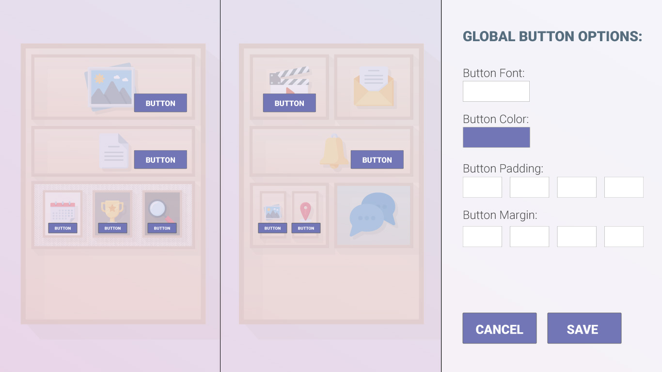
In our physical box scenario, if we wanted to change all the button colors from purple to blue, we’d need to painstakingly pick up each individual button and paint them by hand.
The digital equivalent to this would be selecting each button in the website buildering, and choosing the new blue color we want.
But fortunately there exists Global Styles that save us from this.
In all Website Builders, there will exist a set of presets you can edit that will take effect across every instance of that item across your whole website.
In our button example, this would be you changing the global style for button color (sometimes ‘Accent Color’ among others) from purple to blue. This will automatically have every button across the entire website change.
This is true for fonts, headers, some spacing, and colors for your site across most Website Builders (though exactly how many global styles exist will vary per different builder). Some examples of where to find the settings:
Important Note: If you have changed the options / settings on the item itself (for instance, you changed the color option on a piece of text to purple), this will override any global changes you make. If you make a global style change and are wondering why it’s not being applied to a particular item, click into that particular item and see if there were any specific options added. (As a general rule, try and avoid making style changes to elements as much as possible.)

Box By Box Until The Site Is beautiful
Though a very simplified idea, thinking of your website in the context of items within boxes within boxes can go a long way in helping you build and update your site.
Rather than getting too focused on a particular item you’re trying to update, you can try and think of the page in its entirety, break it down, and figure out what exact setting you need to change.
What is the structure? How is this laid out as far as a box within a box, and how much spacing do the boxes have? What are the settings for this box, or the box that contains it?
What items / content have been added inside of the box? Does it have settings that affect how everything looks?
As I mentioned, it’s an amazing time to build a website. With the right approach and a little practice, you’ll be building beautiful sites for anything you need.
Cheers to your next beautiful website.
Want more tips like this?
Get them, resources, and more delivered to your inbox:
Great article! Really useful to understand fundamentally how these website builders work! I’m off to SquareSpace to start!
Glad to hear it helped! You’ll enjoy SquareSpace, it’s a great platform.
A nice way of explaining how website builders work. I began using WordPress just recently again and came across Elementor as a website builder but found it quite hard to use (maybe it didn’t fit my preference of how it was layed out). Anyway, I ended up settling for thrive architect and absolutely love it, have you tried this before? Thanks for your post.
I hear that a lot with Elementor. It’s really powerful but certainly can take a bit to understand. I had actually not heard of Thrive Architect but will have to check it out, thanks for pointing it out!