Design Trick: Gradient Cut-Out with Canva
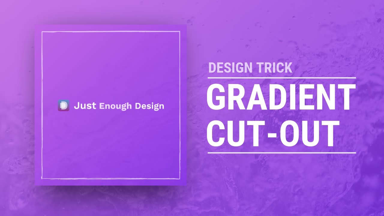

Ever looked at a design and wondered "how did they create that?" The answer to that question can be much simpler than you think!
This design was created in Canva using simple tricks. They're easy to apply and useful for a variety of different effects you may like to create.
Let's walk through it step by step and see how to use the available tools to produce this design!


First we'll start with an image for our background. Something interesting that speaks to our message, but not critical to that message. (Important as we'll be covering it with our colors and letters).
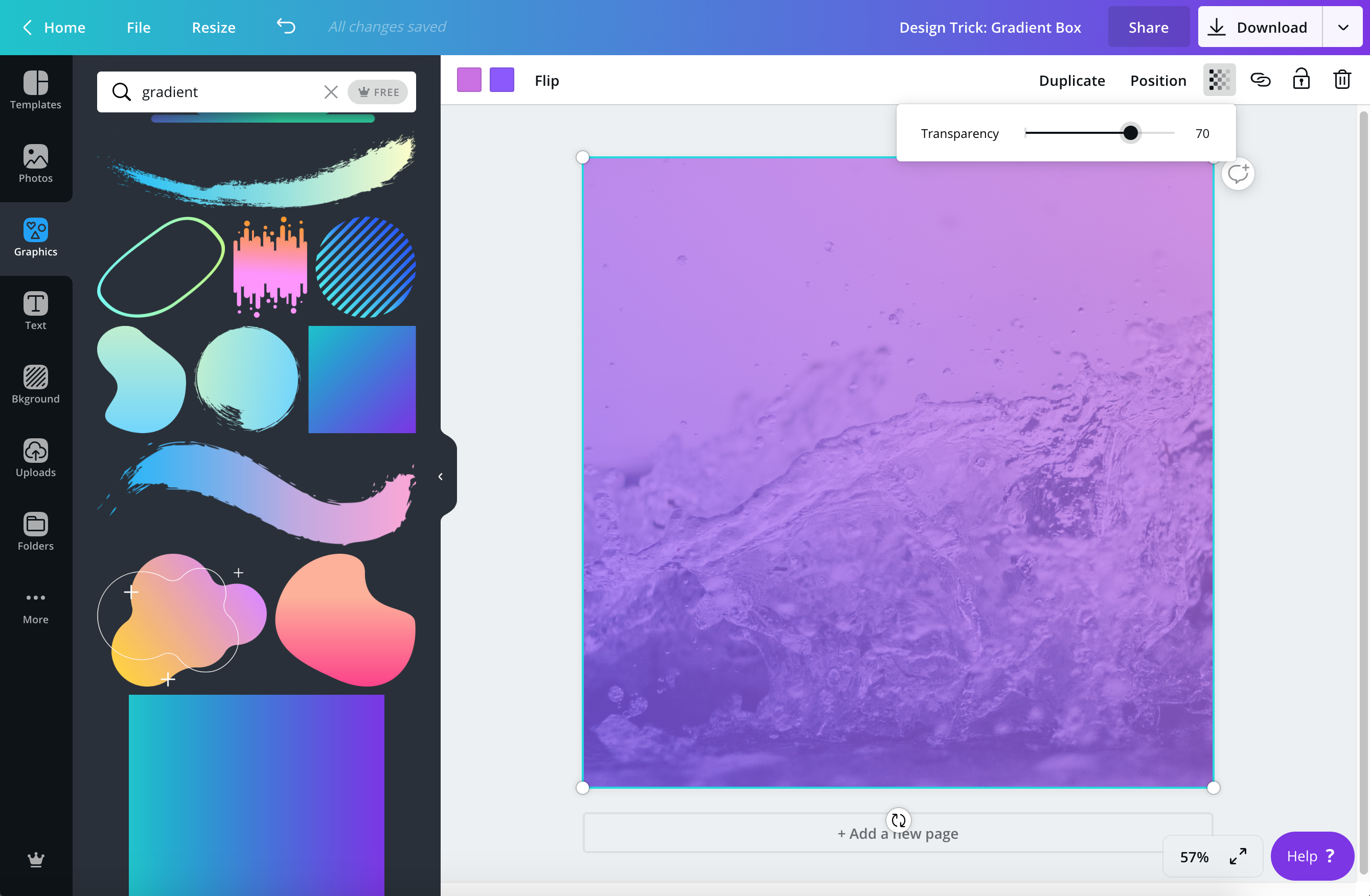

Next, add a Gradient element on top of the image and reduce it's transparency. It's good to have it transparent enough so the image is visible, but not too much to make the color unimportant.
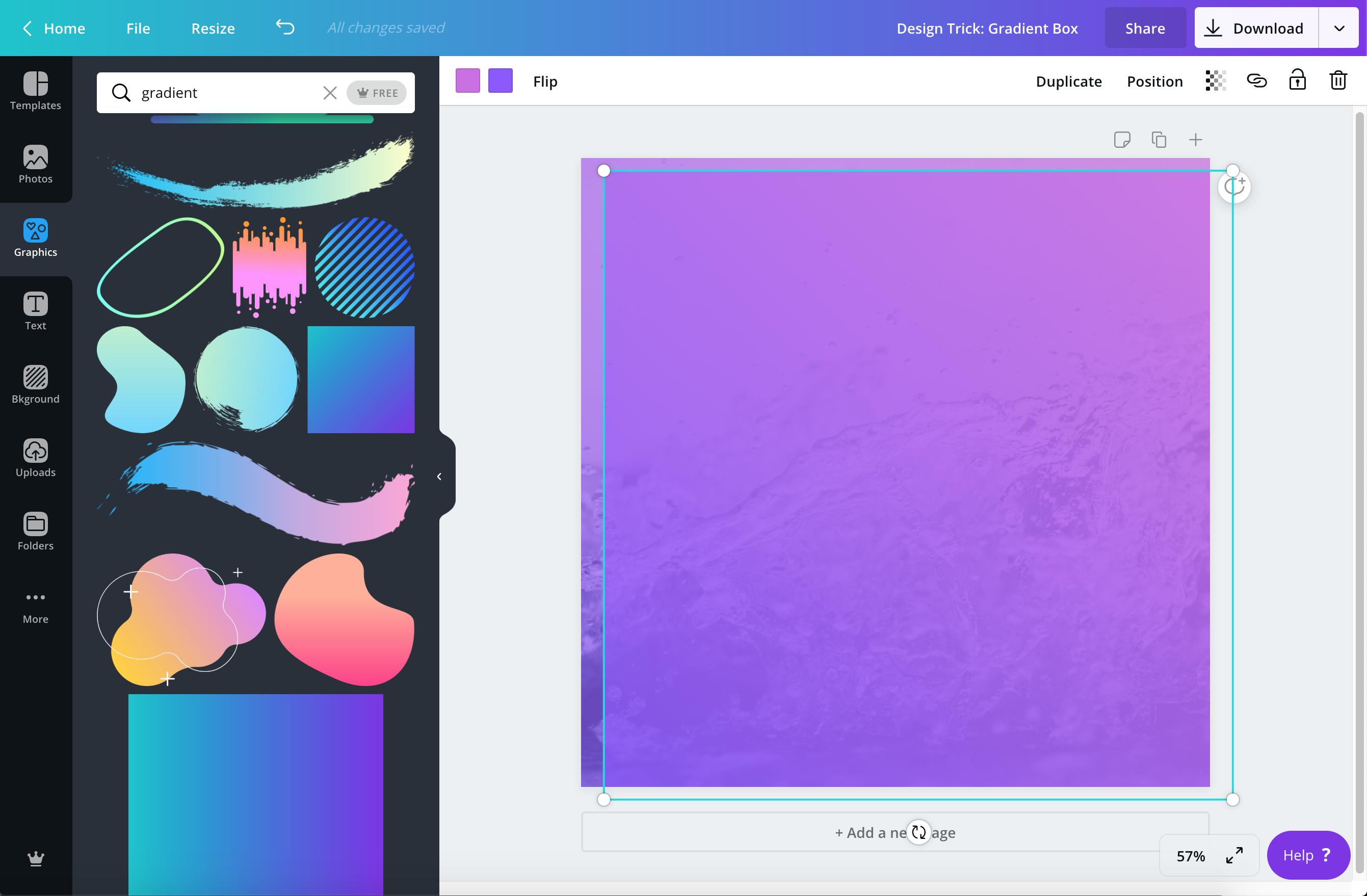

When the gradient element is the way you like it, copy and paste it. Place it exactly over top of the other gradient element.
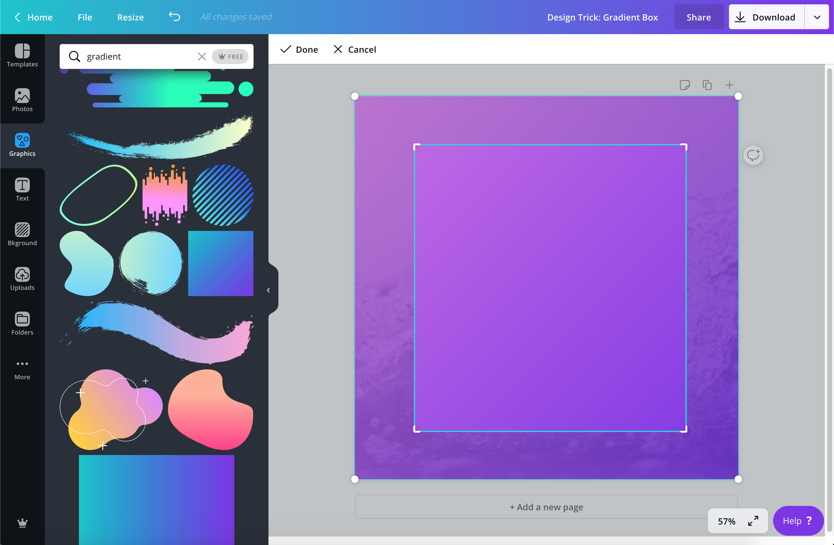

Select it, and choose the "Crop" option from the grey bar above. Drag in the corners so that there is a nice spacing all around the shape. You can make it any size or shape that will work with your content.
When we crop the exact same element on top of the other one, the gradients from each will line up. This way, there is one color gradient that is flowing through the whole design, but two elements. We can to play with these two layers of transparency for cool effects!
Speaking of cool effects. We'll now add a drop shadow behind this new square so it appears to be lifting off from the photo in the back.
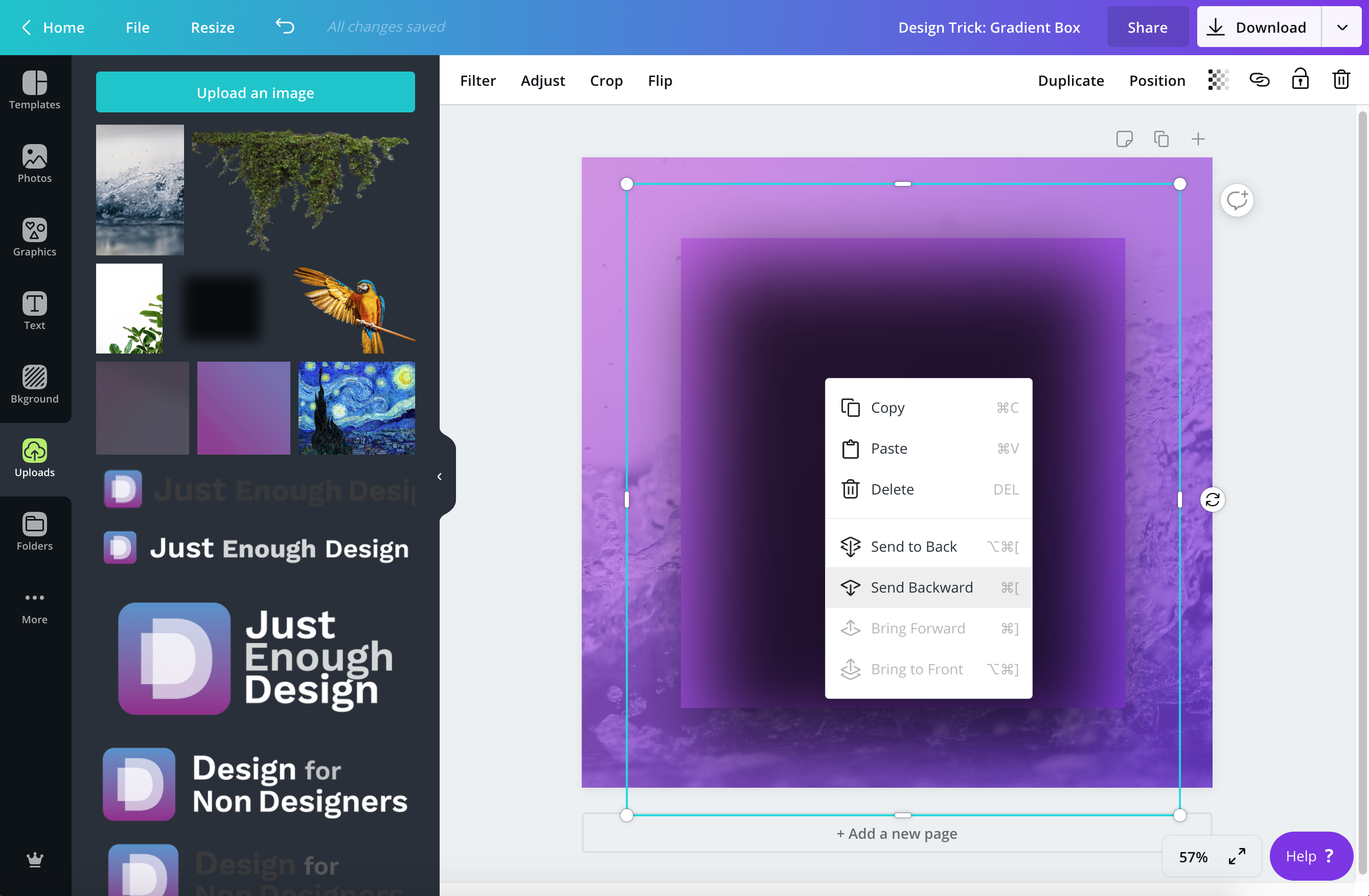

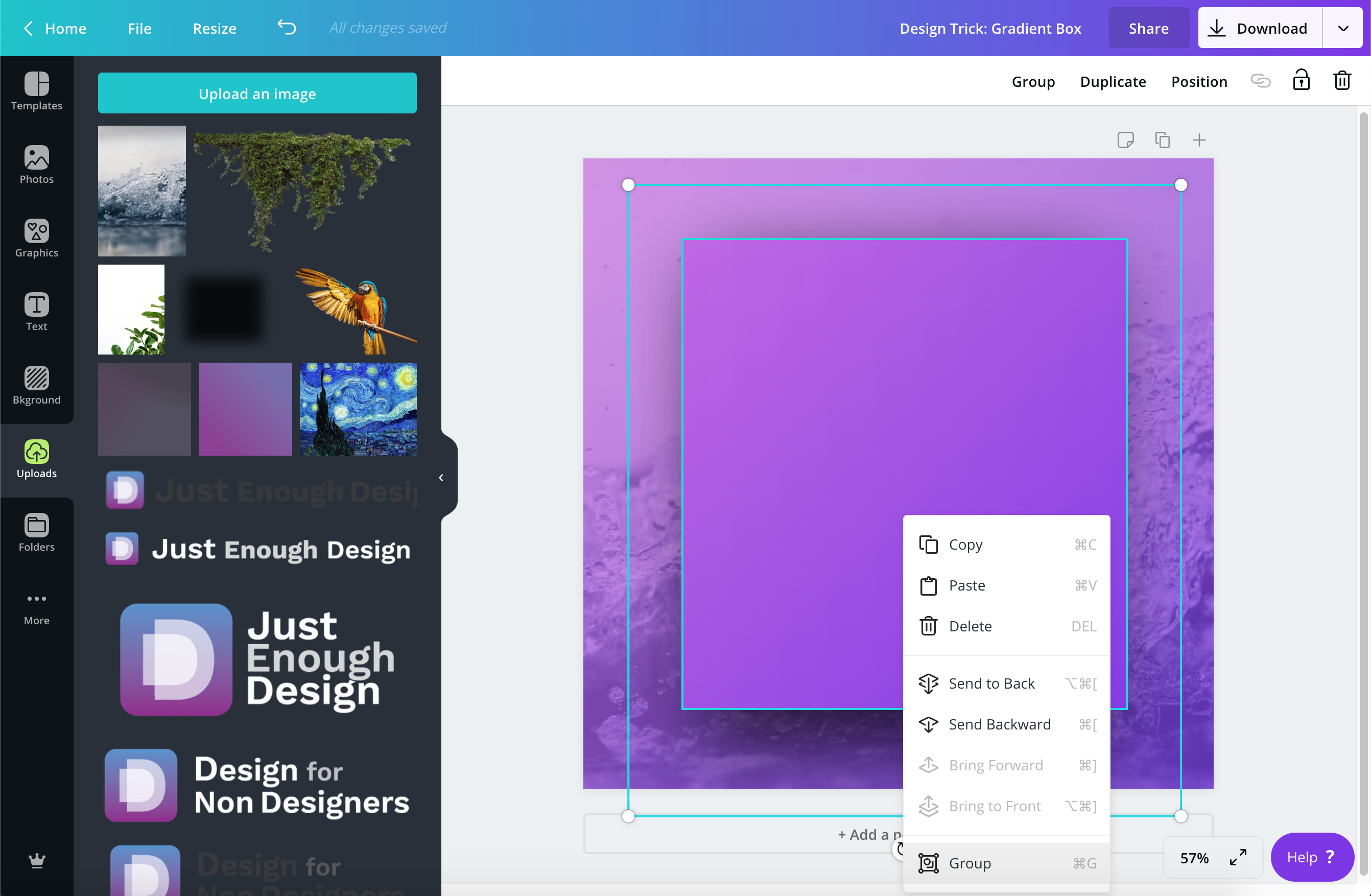

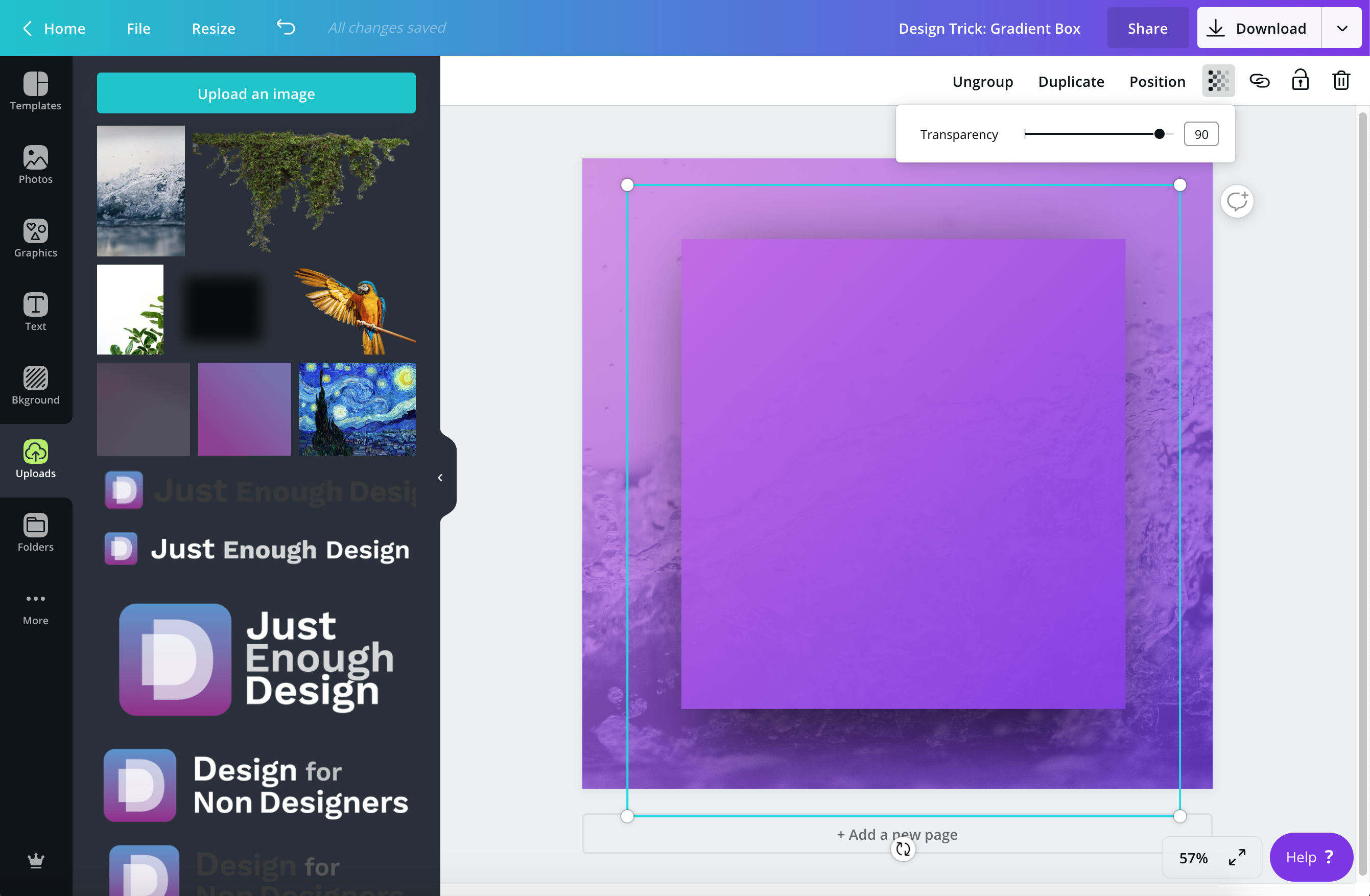


From here we add our text…


…and a border to help focus the eye in the middle.


This was so helpful! Now, I can finally add gradients to shapes. Thank you!
So glad you found it useful! Cheers to some great designs with gradient shapes!
This is super great!
This is super great, I am so happy to be adding to my Canva skills! I was originally looking for how to make a grouped element made from lines have a unified gradient colour scheme… is that even possible? Thanks again!
So happy you found it useful! The best option may be to apply a gradient to a shape, then lay other squares over it the same colour as the background to make it appear as if it’s only lines. You can perhaps find a Frame element that will work the same way for you.
I wish it was possible to use the gradient as a mask to fade an image.